Shades of Brown: Key Basics for Using Brown in Home Décor

Brown. It’s one of those neutrals that may have a knee-jerk reaction of “boring” but in actuality is anything but, when used in the right way. In fact, brown can “induce a feeling of naturalness and comfort to your home”. The spectrum of colors that is involved in the brown color family is actually huge – from reddish mahogany to pale birch and everything in between. Of course, brown colors aren’t all named for trees. Take chocolate, for example. Or mocha or mongoose. As the ultimate neutral, browns are sometimes so associated with “background” that they’re not even seen for what they are – beautiful, critically important colors for many of our home designs. Let’s take a look at a few of the most common.

Vanilla.

Vanilla can be stereotyped as bland and boring, but this is definitely not the case when it’s the color of great grained wood on a statement piece. Pale browns, such as vanilla (aka tortilla brown or blonde wood), should be used in a space to induce feelings of serenity and purity. It is this paleness, in fact, that lends paler browns a sense of elegance, because their tint lifts them out of the mainstream brown-ness.
Cinnamon.

One of the most comforting spices used in cooking, cinnamon brown exudes the same kind of warmth in home décor. As is the case with most browns, cinnamon tends to take on visual cues from its surroundings. That is, the vibe of a cinnamon piece will change when placed in a white space (fresh, perky) versus when it’s placed against black (dramatic, stately). Mix in some irresistible soft, light textiles for ultimate appeal with a cinnamon-colored chair.
Cedar.

Cedar is one of the ultimate outdoor woods, so it makes sense to use the color to create an earthy, outdoor living vibe (even indoors). The color is a medium brown with cool tones, so it’s a nice blend of both warm and cool. Pair with colors on the warmer or cooler end of the spectrum to make the cedar color in your space lean the way you want.
Peanut Brown.

Some ombre effects look well in design when a color simply incorporates gradients of white to become paler and paler. Brown, being the ultimate neutral color that it is, works in an ombre effect when completely different tones are applied. For example, peanut-colored shelves bridge the gap between cool ice-white and a few penny brown shelves, a loose use of ombre effect and distinct color blocking that creates a balanced, grounded effect.
Coffee Brown.

Deep, dark, and fragrant. All the things one associates with coffee-as-beverage can be associated with coffee-as-color. Perhaps this is why the shade works so well in a kitchen area or other place where warmth and coziness is desired. Coffee-colored pendant lights introduce this visual warmth into an otherwise light, cheery kitchen with a lovely, homey effect.
Walnut.

One thing about browns, and neutrals in general really, is that they are so natural themselves and used so often in design and home décor that the colors themselves actually go unnoticed. This walnut-colored bowl, for example, is a notable accessory in this space…but there are many other shades of brown here that, although beautiful colors themselves, simply fade into the background. This isn’t necessarily a bad thing. An important tip to remember when using multiple browns is to significantly vary their lightness and darkness so they can highlight each other, separately.
Taupe.

Perhaps because taupe is like the neutral zone between brown and purple, it is such a gorgeous color when used with both browns and purples. A borderline color, such as taupe, allows a design to incorporate a bunch of color and yet have it still seem neutral. This is, then, a nice way to use color to tone down a busy pattern or print.
Putty Brown.

Blonder wood tints, such as this putty-colored table, are common in Scandinavian décor. Perhaps this is because they blend two distinct design elements – nature/wood, and lightness/airiness – in a beautiful, fresh way. Putty brown adds lightness to darker areas or a grounding force in white spaces, bringing peace and wholesomeness to either space.
Pecan.

While multiple shades, tints, and tones of brown exist in this print, pecan is the medium-dark red shade that really pulls the whole thing together. With its slightly red elements, pecan is an excellent brown choice for energy and positive chi. In a fun and busy print, pecan plays a critical role in providing definition and emphasis to all the other browns.
Copper.

Copper is one of the metals of the moment, design-wise, and for good reason. Its metallic shine while still being warm and, well, browner than most other metals out there make it unique and appealing. With copper, a little can go a long way, so you can use just a small copper piece to make a large statement in nearly any space.
Gingerbread.

This is sometimes the color of leather (like the medium-colored chair in the background here), and a more luxe version of the color-next-door you’d be hard pressed to find. While browns can sometimes represent boredom (think: mud, unless you’re a kid. Then think whole wheat stuff.), they inherently emit reliability. History. Trust. Warm and stately, gingerbread is a versatile and timeless color that works on a variety of pieces, sizes, and styles.
Cognac.

Cognac, glamorous cognac. This neutral has a dramatic, refined presence, which is not always the case with brown, frankly. The color has deep tones and is a bit on the rosy side of brown, making it a neutral that can just as easily be center stage as fade into the background. The color works particularly well on pieces that exude refinement themselves – with mouldings, glass, and/or hardware or details that set it apart from commonplace décor.
Hazelwood.

This lampshade, where hazelwood and soft white are the primary players, illustrates a critical part of using brown in décor. Notice the trunk of the tree in the lampshade’s design – it appears dark and, therefore, the contrasted focus. The same color, used throughout the print, appears much lighter elsewhere due to the amount of white space around each brown line. Hazelwood is a gorgeous brown used in contemporary spaces due to its versatility and cooler (read: greyer) tones.
Tawny.

Tawny brown is one of the most common organic colors used in home décor. It’s neither super light nor super dark. It’s not even medium, either, but rather a softer version of intermediate brown. What makes tawny work on a piece like this, where detail must (and does!) rein supreme, is its foundation for highlights and lowlights in the wood grain to highlight the woven aspect. The “common” color is a perfect host for showcasing standout design.
Oyster.

All well-designed spaces must have contrast somewhere, to provide visual interest and depth. Sometimes this is done with texture, sometimes sheen, sometimes size, and often color. Oyster is a pale tint of brown – the cousin of both white and khaki – that provides a springboard for other colors, even other brown tones, to shine. It’s cool yet grounded lightness contrasts well with darker hues in a neutral (read: monochromatic brown) space.
Sandrift.

A light brown with greyish, almost silvery undertones is sometimes called “sandrift.” This tabletop, for example, is a lovely example. The cooler sandrift is paired beautifully with chunky caramel-colored table legs, which creates a nice yin and yang in color temperatures. This is a great design tactic to keep those inherently dull-toned elements, such as driftwood, feeling contemporary and fresh.
Brunette.
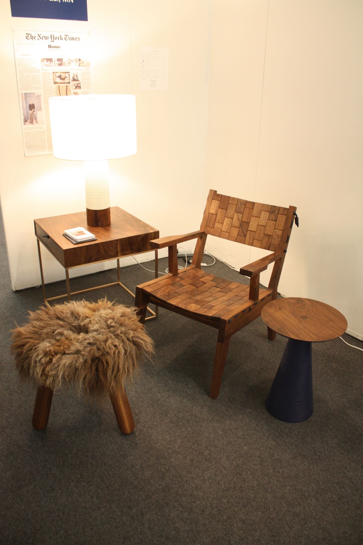
Most of us associate the color “brunette” with hair, and many might call anyone with medium-brown or darker hair by the same name. The brunette that shows up in this charming corner space is more of the shadowed spaces. Where the chair itself might be more of a caramel, the small, warm lighting creates pockets of darker brunette brown. This is often an overlooked element of decorating – taking into consideration all the colors in all the lighting situations and various times of day. A lighter wall is a good choice here to brighten the space overall, but the brunette and darker browns used here certainly create a refreshing sense of comfort and stability.
Tea Brown.

Tea brown is one of the primary elements of the flooring in this photo. A lighter, unassuming brown, tea brown perfectly blends a bit of grey with its brown-ness for a harmonious and rather encouraging aesthetic. The darker sorrel brown look of the countertops and sink in this photo pulls neatly from the flooring grain for a cohesive look. And it’s my opinion that the colors that work best in a food-centered space (like the kitchen) are colors that are also edible. Tea brown is a design shoo-in.
Dark Chocolate.

This multi-toned wall contains elements of milk and dark chocolate, with a fantastic effect. In an industrial space, where metal and harsher decorating elements are key, comforting accent wall color(s) create balance amid the contrast. Working in a variety of ways (e.g., background and/or accent), browns are pro at blending with not only other browns but also other colors for maximum aesthetic appeal. Personally, I think the charcoal grey wall next to this dark chocolate one, brought together by the metal barrel sink, is genius.
Mondo Brown.

This lightened up version of cool mondo brown is the epitome of the concept that color and design enhance each other. While mid-range browns, by default unless proven otherwise, have a color association of being dull and non-creative, they can be proven wrong by being the color of choice for a standout design. In this way, the piece itself and the color don’t compete with each other; rather, they play their dual roles to perfection, as is the case with this gorgeous mondo brown freestanding oval bathtub.