Discover The Joys Of Neutral Colors And How To Use Them


Neutral colors are a constant part of our daily lives. Whether as accent colors or interior design elements, they’ll always be there. You may hear “neutral colors,” and have a vague idea of what that means, but it’s important to understand it.
It doesn’t take a skilled expert to work with neutral colors. This feature could be the reason why they’re popular instead of other colors. If you’re considering a living room makeover, for example, and you need color guidance, so you’ll like the neutral paint colors that we’ll show you.

If you’re indifferent about neutral paint colors, we’re going to change that. First, we’ll review neutral shades. Next, we’ll show you how neutral shades are critical colors. And we’ll also give you a few tips on how to use them with other colors.
How To Use Neutral Colors For Your Next Makeover
Paint colors influence your design choices. Color reflects personality. Finding the best neutral shade requires effort, but the reward is worth it.
Light Beige
As a warmup, light beige is arguably the most popular interior neutral color. Notice how the console paneling is the same color as the wall. That’s not a coincidence. Home décor should be used as a color enhancement.
Cream Color

Let’s delve a little deeper into the world of neutral colors and see, first, what neutral colors are. As you can see here, cream provides just enough warmth without overdoing it. You can use the color in almost any room as it provides the perfect backdrop.
New Neutral Colors
Designers have expanded the range of colors considered to be good pairings with neutral colors. The new neutrals blend easily and are versatile. Each neutral color branches out beyond the expected and increases the range of options for your neutral decor.
Muted Blue

With undertones of gray, muted blue works well with a wide range of neutrals as well as accent colors. Above all, neutrals are calming, and blue is associated with serenity. Blue is said to convey a sense of dependability, and sincerity among other emotions.
Plus, it’s a popular color in most surveys. This Mridul bedding arrangement uses a blue pillow as an accent, however, it’s just as serene as the rest of the items are.
Navy

If navy blue is not in your toolbox of neutral colors, it should be. The color is a classic. It’s a perfect neutral for furniture because it anchors a room while giving enough leeway for almost any color as an accent. Blue undertones also work well.
It can save a room from being too boring by virtue of being too safe. A chic velvet sofa like this example is from Quality & Co., is a good example because it’s a piece you can build a room around.
Sage Green

The rising star on the neutral color wheel is sage green. It can be used as an accent color or as a backdrop. You might be that you can mix this gentle color into every space, from the subdued to the vibrant, like this example from Eunoia Modern.
Benjamin Moore offers sage green in a range of tones that compliment any decor layout.
Light Mauve

This soft shade is a pale purple with a pink or blue undertone, but the trend veers toward neutral colors that could be classified as gray. In the 80s, the color was brighter and overused, today, mauve falls into the realm of neutrals, like this chair by Phase.
According to Color Psychology, the name comes from a common flowering plant that produces light purple petals known as “malva.”
Earthy Red

Red as a neutral does not include what you think. The color can go in so many directions. Instead, this earthy color relies on brown undertones. When you add earthy red, you create a new dimension. The decorating style uses a dramatic patio chair by Kenneth Cobanpue.
Lilac

With its gray undertones, lilac is the perfect neutral for pairing with black, dark gray, or navy. On its own, it might feel feminine, but combined with bold colors, it shows its blendable nature.
Depending on your natural lighting, lilac can look gray, taupe, or mauve. Lilac adds a softer edge to a darker space and, used in a lighter neutral color palette, adds dimension without becoming feminine.
Charcoal

As versatile as a men’s charcoal suit, this shade is a staple in living room design with neutral decor. Not as bold or oppressive as black can be, charcoal provides the same accent impact with a lighter hand.
This accent table from Ginger Brown works with any color scheme without the sometimes jarring visual that a jet black piece provides. Shiny or matte, charcoal can also exhibit undertones of other colors, such as browns or greens, so try various shades to find the one that best compliments a room.
Pink

You might have had your fill of millennial pink but there’s a reason that pink is here to stay: It’s nearly the perfect neutral. Pale, rosy shades blend with everything from earthy colors to bold jewel tones. Neutral pinks offer a range of undertones from brown to blue.
Many cream shades have pink undertones too. These blush colors are super versatile and will go with just about anything that you have. This setting from Langdon Ltd. uses pink shades. You’ll notice how the wall undertones push it into an earthy blush range.
Pale Yellow

Yellow is another popular new neutral color that is ideal for adding to your nursery, children’s bedrooms, or living room. Pale shades of yellow are so light they are closer to cream or white in color. However, that makes them easy to use in most spaces. If you desire a bold color, bright yellow is a neutral option when working with a terracotta undertone.
Silver

While gray is a classic neutral color, silver takes this shade up a notch and adds sparkle in your home. You’ll have no trouble finding silver accessories in stores nowadays, and they work with almost any color of the room.
This silver and white bedroom makeover show you just how modern yet sophisticated this color scheme could look in any room.
How To Define A Neutral Color

Neutral, in this instance, means lacking or being without color. Or, in other words, unsaturated with color. But neutral colors are still colors, so a better description would be something like “a hue that appears to be without color.”
Home Décor

The reason why neutral colors are so popular is that they work in almost any space in your home. Neutral colors are easy to layer, which is why they are good for anyone who is new to DIY.
You’ll find that you can start off with the more muted tones of one color, before adding bolder and brighter splashes of color.
Brown or gray are excellent colors to layer, and you’ll find paint and products in every shade you could ever imagine when you start shopping for your home makeover. To help you learn more about decorating with neutral colors, let’s take a look at some of the key benefits of using neutral colors in your next home makeover.
Decorating With Neutral Colors
Neutral colors are by definition unsaturated, allowing them to serve as the relaxing background to a space.
Soothing
Something to remember about neutrals: nature-based elements tend to be inherently neutral themselves and complement a neutral space’s decor.
Augment Color Qualities

No matter your design style or preferences, there is a place for neutral colors in your décor. This is because neutrals provide an ideal decorating foundation or background, which lets you add in layers and/or pops of color to create depth in your space.
Patterns And Texture

Because of their neutrality, neutral colors benefit a space by encouraging the use of patterns and textures without becoming an eyesore or a visual headache. One thing to keep in mind: the greater the contrast between your neutrals, the busier a space will read.
Flexibility

If you respect modern minimalism, simple Scandinavian, rustic, or French country décor (or anything else), neutrals will likely play an important role in your successful décor. Vary the neutrals’ use in geometrics for a classic and relevant appeal.
Color Palette

Neutral colors used in a home can have warm or cool tones. This versatility increases the usability of neutrals as a whole – simply identify the warmth or coolness that your space needs and choose loved neutral colors.
Color Foundation

Your space’s design possibilities and potential will expand with the use of neutrals because you won’t be limited to one specific color or scheme. Instead, neutrals will open up vast opportunities and possibilities in every color direction.
Increase Resale Value

Maybe you love the avocado bathroom fixtures and tiles of your 50s rambler, but that doesn’t mean everyone does. Opting for neutral tones in your interior design will attract more potential buyers, should you decide to sell, then bright, specific colors will.
Neutral colors also increase the flow from room to room in a home, which is something that homeowners want. In other words, neutrals have a mass appeal across style, taste, and preferences.
Easy To Decorate

When your space has a neutral foundation, you will more easily be able to change up the décor and furnishings without having to scrap everything and start over. In other words, decorating with neutrals as a foundation is both time and cost-effective.
Children’s Bedrooms

One area of your home where we recommend using neutrals is in your children’s bedrooms. As your children grow, they’ll want to redecorate their rooms.
Color Layers

When decorating a room, we always recommend taking a slow and steady approach. Adding layers of color to your room can help you to upgrade your room without putting too many dark or bold colors in too early on in the process.
Neutral colors can easily be layered, and by opting for a brown or gray theme in your room, you can then make the shades darker as you start feeling more adventurous.
Decorating With Neutral Colors
Let’s review the most common challenges people have when working with neutral colors.
Boring
Part of the reason that neutral colors have gotten such a bland reputation is the fact that they are “safe” to use, which leads many people to stick to neutrality and nothing else. To overcome this challenge, look outside of neutral colors when choosing accent pieces, rugs, and wall colors.
Think Beforehand

Neutrals still have shades and tints and tones. Being aware of these underlying tones is important while matching or coordinating colors or picking paint. Beige might have pink or golden undertones, while white undertones can vary from ivory, blue, or even peach.
Design Strategy

As we’ve already discussed, every neutral color has many (infinite?) shades, tints, and tones within it. Take the mother of all neutral colors: beige, for example.
All of these are considered “beige.” However, you need to know which ones will work with your space, lighting, and with your other design elements and furnishings.
Bland Effect

We’ve all walked into a spec home and been assaulted with tan moldings upon tan walls upon tan carpets upon tan tiles, haven’t we? Avoid matching drab walls with drab carpets.
Neutral Challenges
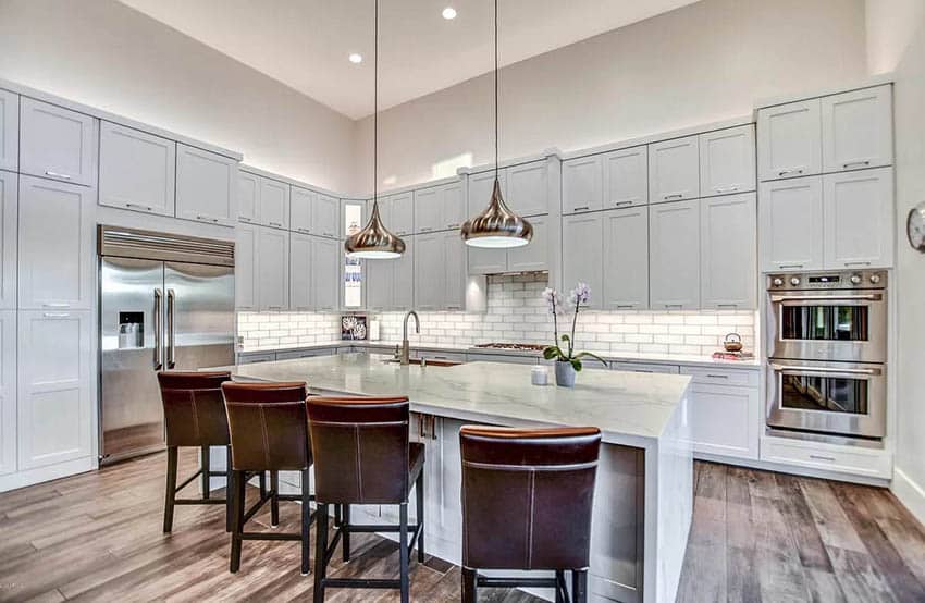
Neutrals can be more challenging to add to some rooms in your home in comparison to others. For example, the kitchen is often a place where you’ll need to use darker neutral colors, as white or cream walls are sometimes harder to maintain in a room where so much cooking takes place.
When decorating younger children’s bedrooms, choose a light shade that will help hide dirt on the walls.
Specific Uses Of Neutral Colors
Beige

Many people gravitate toward white in the kitchen these days, but beige can be a gorgeous, creamy alternative that keeps the kitchen feeling warm, welcoming, and still fresh and light.
Ivory

A pale, velvety alternative to beige and rich, deep alternative to white, ivory provides all sorts of chic neutrality. Where natural light is abundant, ivory uses that light and transforms it into a softer, albeit vibrant version of itself.
Taupe

Taupe tends to have purple undertones and thus pairs seamlessly with elements of warm purple as accents, such as are present in this gorgeous Pieper Glass lamp.
Black

Black is the most striking of the neutrals, as the darkest and most color-absorptive hue, there is. Using it adds unqualified sophistication to a space. A good way to use black in a non-overbearing way is to opt for more delicate, detail-oriented black pieces such as these Hubbardton drop pendants, where the black silhouette shines.
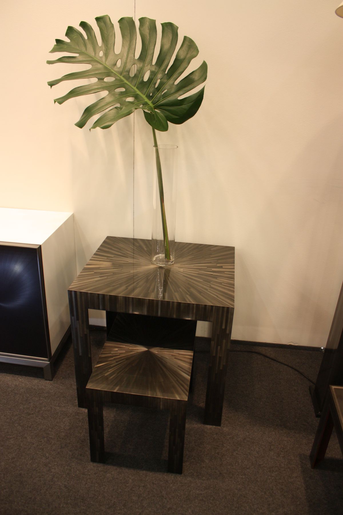
Brown
A sunburst-topped side table or pair of nesting tables, such as these Kanin displays, look wonderfully natural in their two-toned brownness. Remember that the darker the brown, the more of a grounding effect the tone will have in the space.
Grey

As a more saturated alternative to the all-white modern kitchen, grey works wonderfully. Consider warming up this popular neutral shade with a piece of wood or other nature-based detail, as grey can read as stark and uninviting if overdone.
White

White is a dreamy, airy color with which to decorate (a favorite among monochromatic spaces). It appears best when thoughtfully styled with various shades of similar undertones, which would create depth and a visually interesting space.
White is also a lovely neutral in two-tone décor and furnishings, as is evidenced by this Ruby Lux chair.
Gold

While the debate might rage over the color gold, it’s neutral because it goes with everything. When using gold, consider the sheen. If you add too much, the shine and neutral element is decreased.
Frequently Asked Questions (FAQ)FAQ
What Color Neutralizes Yellow?
To neutralize a color, apply its color counterpart. The opposite of yellow is purple, so that’s how you would neutralize yellow. Interior designers use purple paint to cancel yellow color schemes.
What Are The Most Popular Sherwin Williams Neutral Colors?
Gray and white are the most popular neutral paint colors Sherwin Williams offers. Specifically, “agreeable gray” and “pure white” are at the top. Another favorite is the Sherwin Williams balanced beige.
What Are The Neutral Colors On The Color Wheel?
This is a trick question. The color wheel does not have neutral colors. Popular neutral colors include beige, taupe, gray, cream, brown, black, and white. Neutral colors are used to complement the primary colors of the color wheel.
Is Lavender A Neutral Color?
Interior designers agree that soft lavender is a neutral color. There isn’t a color that lavender doesn’t go with. For dramatic effect, combine lavender and red. And if you want to create a soothing vibe, try chocolate and lavender.
What Are Gender Neutral Colors?
White, brown, green, yellow, and orange are not gender specific. The colors pair well with masculine and feminine shades.
Neutral Colors Conclusion
Regardless of your color scheme, you won’t have any problems painting your walls in neutral shades. With neutral interior design, colors are easier to work with, including accessories and furniture accents.
Neutral colors offer budget friendly solutions when redecorating your home. If you’re bored with your home’s color scheme, add a few accessories to your neutral bedrooms to change their look and feel.
With the benefits of working with neutral paint colors, it’s no surprise how they’re included in most home makeover projects.