Shades of Red: What They Are & How to Use Them in Home Décor

Red is one of the three primary colors (red, yellow, and blue) and, out of all the colors, is one of the most powerful and evocative of emotion. The warm color is energizing, exciting, and intense. It is associated with the passionate, for good and for bad, leadership, and action. Red is somewhat tricky to incorporate successfully into home décor, simply because of its dominant nature. Here’s a look at many common shades of red and how to figure out what’s best for your space.

Blood Red.

Red is the color of the fire element in fengshui and, as such, it is the color of warmth, excitement, and passion. Blood red in particular is a fairly neutral red, meaning it has no determinable cool or warm tones; this shade will look well in most spaces as long as you pay attention to the intensity and texture of the piece(s) it shows up on.
Berry.
Cool reds, such as this berry color in this interior, have a bluish undertone. They tend to enhance the calm and serene feel in a space because they neutralize warmer yellow components, which in turn the warmth and overall energy in the room.
Scarlet.

The strong response to red can be used to your advantage in home décor, if you want to emphasize a great piece of furniture or architecture. The overall effect can be somewhat manipulated with the addition of black, as is the case with this scarlet lamp stand and black lamp shade. Warmer reds, with an orange undertone, tend to be the most dramatic of the reds.
Currant.

Reds can be the primary color in a room’s color palette; however, it is generally recommended that the color serve more as an accent or in other, more subdued ways. Currant red dining chairs, for example, provide an excellent point of emphasis in a cool, dark space – the color’s own blue tones matches the atmosphere, and the red brightens up an otherwise aesthetically heavy room.
Blush.

While we aren’t exploring pink in this article (you can do that in our Shades of Pink article), there are definitely some lighter tints of red that can be considered red. Blush red, for example, is used in a contemporary space with clean lines to bring out a bit of aesthetic sensitivity and even love without being ragingly passionate.
Chili Pepper.
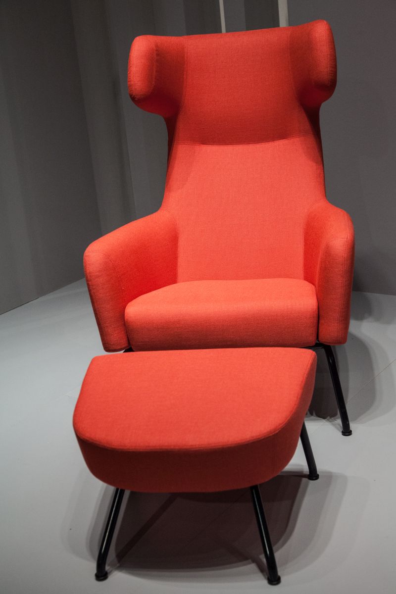
“Use red to give a resonant and stimulating aspect to your rooms”. While red can sometimes come across as a somewhat threatening color, warmer versions such as the chili pepper color of this chair and footstool help to increase the friendly feel.
Vermilion.

Vibrant as the day is long, red is an often-overlooked but still excellent choice for lighting fixtures. Its warmth and positivity actually aligns with the human body’s will to survive, making it a perfect lighting fixture choice. Vermilion, as a warm tone itself, is particularly effective in this way.
Sienna.

As we are well aware by now, red can be quite overpowering if used with reckless abandon in interior design. So it is with caution that you should approach its large-scale use in a space. Instead, it is recommended that you try to scatter it throughout a space. Share the aesthetic weight of the color, in other words. This is especially important where red walls, which can be intimate and cozy but also dominant, are concerned.
Ruby Red.

Paired with white, ruby red feels crisp and sweet; however, the sophistication of the space is brought up significantly with modern design elements. It is these same elements, which are emphasized by their ruby red color, that motivate us toward action, ambition, and energetic determination. This photo depicts a setting of leadership and not complacency, due in large part to the color choices.
Brick Red.

Reddish browns, which tend to be dark browns but not always, are associated with the harvest. These colors, such as brick red, are masculine and authoritative. Soften its visual impact with some slimmer or more feminine pieces, such as the leggy chairs and chandelier in this space.
Tomato Red.

As a powerful color, red is often chosen as a color for flags or other political statements. In our homes, the color should be treated with as much importance as the messages and symbolism of one’s flag. Use a vivid tomato red on a curtain, for example, and pair it with a classic black and white print for a stunning visual statement.
Papaya.

It should come as no surprise that red in home decor is often served best when large expanses of the color are broken up and/or diluted to diffuse its power. A papaya wall color, for example, is brought to a more visually manageable level with the incorporating of interesting hex mirrors and wood frames scattered across the surface in an artistic way.
Mahogany.

Dark red, it is probably obvious, is associated with energy, willpower, rage, courage, and evil. Temper the intensity of these color associations with some crisp lines, some bright metallic details, and some sparseness on the use of dark reds like mahogany. They are beautiful colors, to be sure, but they should enhance, and not bully, the space.
Cherry Red.

Cherry red is as friendly as can be. It works well in a casual, informal setting (such as a paint-smattered chair in the form of a sunset or a rainbow) because it’s on the brighter side of red and, therefore, is less dignified and somber than dark reds. You can use cheerful reds on more formal pieces for an interesting and quirky design statement.
True Red.

Red is an intensely visual color that evokes a just-as-intensely strong sense of passion, whether for good or evil. Red often steals attention away from other colors, which can be useful but should be done intentionally and not passively. Red can symbolize pride and strength.
Watermelon.

Of course, one’s design choices can dictate the amount of red in a space. When it’s placed in a background, sort of afterthought position in décor (the watermelon-colored internal upholstery of a back-facing chair, for example), red flashes a happy shred of color but allows other elements to shine. Lighter reds such as watermelon radiate joy, and they are an important piece of a more subdued, cool palette.
Crimson.
Crimson red, as one of the strongest neutral reds, radiates a strong masculine energy. While red seems like it can be anything but neutral, there are actually certain reds that are considered “neutral reds,” meaning that they are true red tones without discernible cool or warm undertones. Crimson red is versatile and looks well in both cool and warm spaces, or it takes center stage in truly neutral ones.
Lipstick Red.

Red set against a dramatically dark background or in harsh, precise patterns with other dominant colors will have a highly stimulating impact. The drama of the lipstick red in this space, for example, is heightened by its surroundings; imagine the same setup with a white wall instead of black. It would be quite different even though it would still be visually striking.
Terracotta.

This particular red tone could easily be grouped into the brown or orange family because it combines all three – red, orange, and brown – into one warm, friendly hue. Rusty reds like terra cotta represent change, similar to how the fall leaves turn colors in the transition from summer into winter.
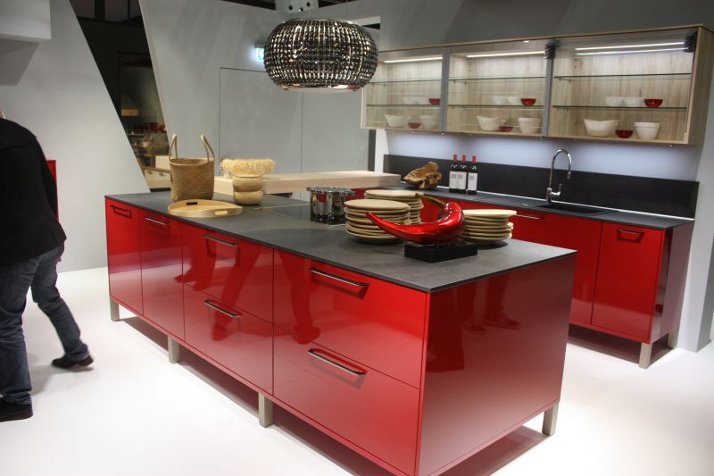
Flame Red.

Red and orange (and orangey reds, like this flame red) have been associated with appetite stimulation, which makes them popular colors for use in kitchens and restaurants. Warm reds tend to be brighter and more cheerful than their cooler counterparts; they also bring out the warmer undertones of the surrounding space, so use this to your advantage.
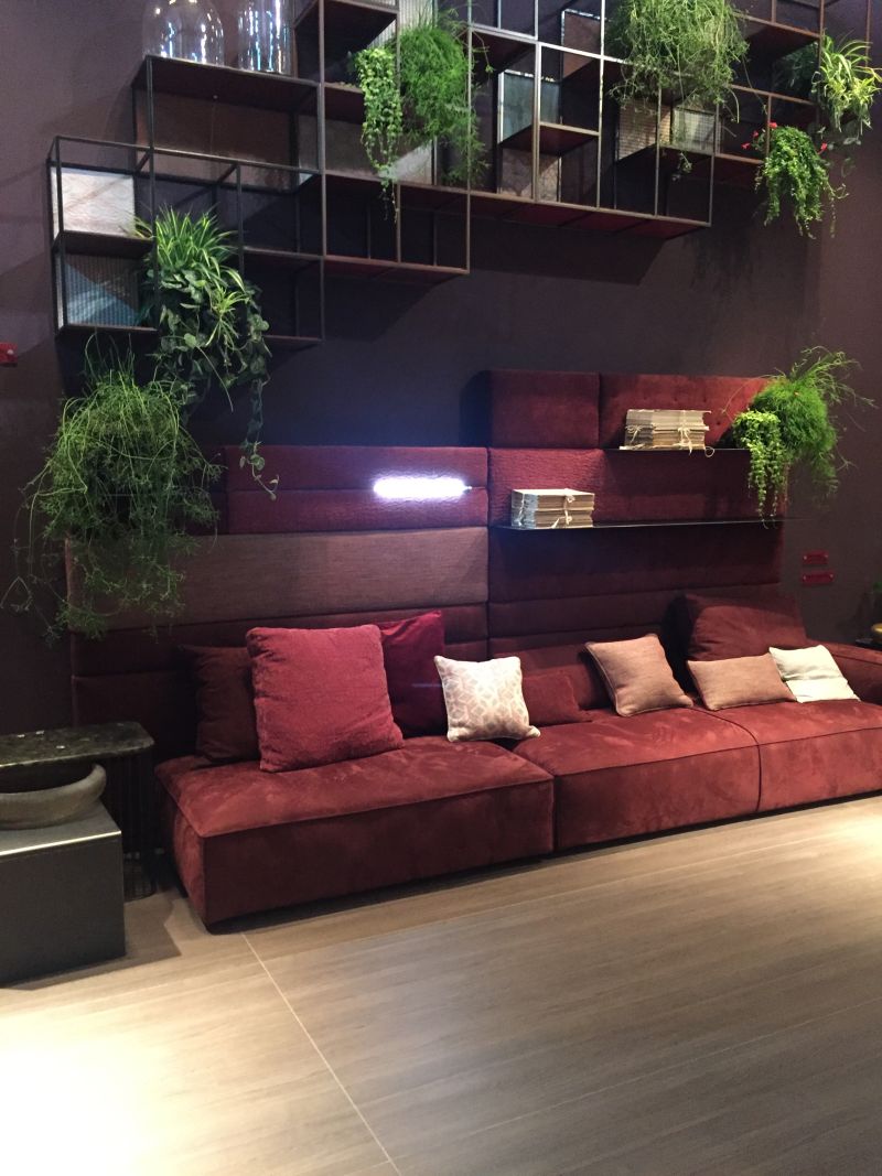
Burgundy.

Dark and dramatic, deep reds like burgundy are confident and full of a stately sort of vitality. Burgundy is sensual and intimately passionate as well. It needn’t be confined to the bedroom, though, to bring out a cozy, intimate atmosphere. This dining room illustrates a gorgeous space where close conversation will be sought and enjoyed.