Shades of Blue: Common Blue Colors and How to Use Them in Your Home

Blue is the only one of the primary colors that exists in the cool spectrum. All other colors must have blue added to them to decrease their warmth and energy and increase their serenity. Thus, blue is a calming color with a wide range of influences, from creativity and freedom to security and trust. Blue is a rather forgiving color when it comes to its being incorporated into home décor, but here are many of its common shades and how they might work in your space.

Arctic Blue.

The electric blue of the lights in this photo represents arctic blue, a color that gets its name presumably from the combination of sunlight and water and ice. It’s an interesting concept, the combination of the calming color blue with the freezing concept of ice, although the two ideas are similar when it comes to an atmosphere of clarity and meditation. Some cases have even shown that the color blue can help to decrease blood pressure and heart rate.
Cerulean Blue.
As the color of water on earth, blue is easily adaptable to create a cool, clear, refreshing aesthetic. Despite the fact that water assumes a variety of blue hues, depending on various environmental factors, almost any blue color (like cerulean) can be associated with some sort of water. In fengshui, this equates the color with refreshment and clarity.
Ocean Blue.

As has been discussed, blue has close associations in the natural world with the sky and with water. Because of this, the incorporation of a blue that appears in nature, such as ocean blue, will add a vibrant feeling. It’s important to remember that blue, as the only color within the cool spectrum, is pivotal for creating other colors with a calming influence.
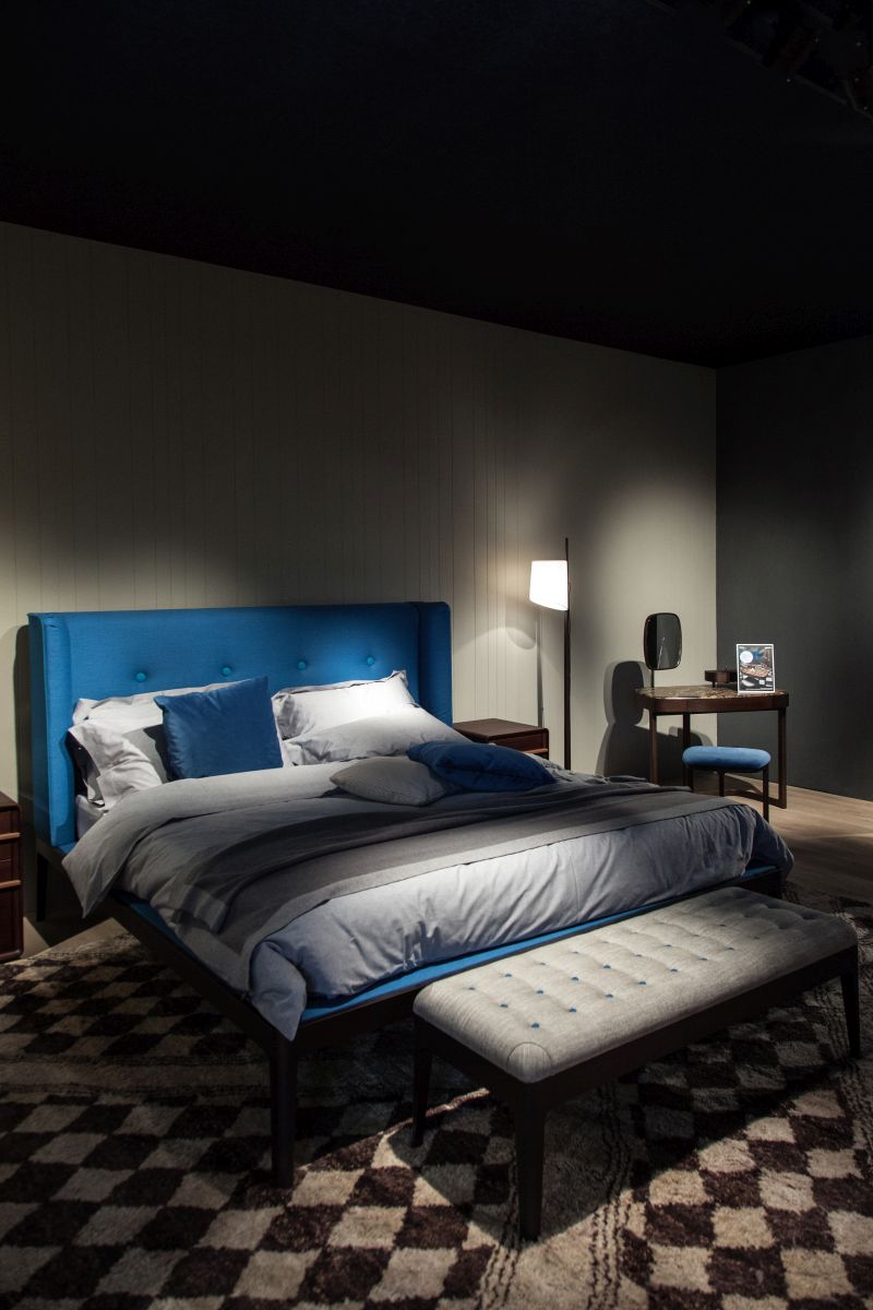
Aegean Blue.

This photo shows another way to use water-inspired blues, with Aegean blue as the bed frame and pillowcases. Pairing it with rich yet simple patterns and dark walls creates a cozy, intimate space. The brighter, lighter blue in this room keep the other neutrals from feeling tired and staid.
Sapphire Blue.

A range of blues is represented in this photo; sapphire blue is a particularly beautiful addition. Blues are the hues of peace and security; when a variety of blues are used, there is an overall refreshing aesthetic created. When the range of colors is on the cool side of things, the effect is a more subdued space.
Military Blue.

Blue is extremely versatile in the design world as both an accent color and a background color (and everything in between). Darker versions of blue, such as military blue and navy, feel more masculine. These tend to symbolize loyalty, strength, and trust, which in turn can calm the psyche.
Berry Blue.

One of the rare instances in which blue appears as food is in the form of berries, and even this is more of a purple than a true blue. The pillows in this photo are a vibrant berry blue and add a cooler accent to this rather warmly neutral bedroom. Berry blue is a wonderful color choice here, as it is sincere and independently visual. Avoiding confrontation is one of blue’s fortes, and what better place to infuse that sense of trust and acceptance than in the bedroom.
Ice Blue.

A variety of crisp, pale blues complete this seating arrangement, and the effect is almost ethereal. Light blue represents peace, faith, and health, and it’s no wonder – the beautiful ice blue of this sofa, among others, is nothing short of breathtaking.
Turquoise.

Turquoise is one of the memorable hues that hovers between blue and green in a most becoming, friendly, and attractive way. While various shades and tints of turquoise exist (meaning, it can appear darker and lighter and still be turquoise), each is fresh with a feeling of common sense; however, lighter, muted versions of turquoise tend to be more liberating and relaxing. Use turquoise as an accent among whites, and you’ve got a completely refreshing aesthetic.

The top right light fixture in this color shows how a blue hue such as turquoise can be deepened and darkened, taking on a more mature aesthetic without losing its colorfulness.
Cornflower.

Blue is often referred to last in the list of primary colors, although it’s first in bringing a sense of happy calm to a space. (Perhaps this is why a color similar to cornflower is used by popular social networking sites.) Light blues are often relaxed, which makes them excellent companions to natural elements such as wood and stone.
Spruce Blue.

Dark, deep, moody blues such as spruce blue are known for showcasing knowledge, power, trust, and integrity. Dark blues like this are also used frequently where a sense of responsibility is sought; the color here would work nicely in a den, library, or other focus-requiring space.
Midnight Blue.

As has been discussed, dark blues are excellent color options for spaces where strength and reliability are desired to shine through. Midnight blue is among the darkest of blue shades and, as such, makes a wonderful wall color for a teenage boy’s bedroom or another study area.
Cobalt Blue.

The bright blue of cobalt has not only seen a spike in interior design popularity in recent years, but it also spikes the energizing capacity of a space immediately. The feeling is young and hip; paired with a funky print in classic black and white and emphasized with a couple of red accents, these cobalt shelves are refreshing, youthful, and exciting.
Denim Blue.

Another darker blue is denim blue, and this one is as reliable as they come. Denim blue, among other darker shades of blue, is believed to encourage efficiency in thought and prioritizing; perhaps you can cut mental clutter and make clearer decisions when denim blue is in your midst. Try incorporating a piece with denim blue, and not just on your jeans – think of a wastebasket, a pen holder, or a task lamp.
Royal Blue.

Royal blue is fairly close to true blue – a bright, unapologetic blue that takes center stage rather easily or is happy to work in the background. The geometric structured pattern of this royal blue and ivory rug provide a solid visual foundation for fluffy mint-green shag, which is an interesting and charming combination altogether.
Cerulean.
“The idea of associating blue with male babies may stem back to ancient times when having a boy was good luck. Blue…held powers to ward off evil, so baby boys were dressed in blue”. Regardless of their juvenile associations, lighter shades of blue (such as cerulean) can look every bit as modern and grownup as their darker blue companions when incorporated into a contemporary, abstract, and/or geometric design.
Sky Blue.

Ah, sky blue. It’s wholesome, it’s hopeful, and it’s refreshingly friendly. The color is all things bright in the future and all things sweetly nostalgic in the past. Interestingly, though, blue of any kind is rarely associated with food (or used in the kitchen) because it is said to decrease appetite. Maybe that’s why this gorgeous vase is used for the floral centerpiece.
Indigo.
Indigo is a complex color. It’s purple and blue at the same time, and one side of the spectrum doesn’t seem to ever dominate the other – it’s equally purple and blue. Which is perhaps why indigo is so inherently helpful; it doesn’t take sides. It simply exists to infuse your space with a beautiful, deep hue.
Slate Blue.

One of the more somber tones of blue, slate blue (which is largely grey) symbolizes strength and reliability. Its physical effects include: soothing, chaos-preventing, communicative, perspective-inducing, intuitive, and peaceful . Quite a nice color, frankly, to hang out in the background as you study your reflection in a round mirror.
Aquamarine.

As was mentioned, blues are rarely used in association with food. This is due to both its rarity in natural foods and its inherent calming effect; the latter is believed to actually suppress a person’s appetite. Aquamarine, however, is a warmer version of blue and, as such, can work in the kitchen because of its somewhat invigorating essence.
Periwinkle.

A pale purplish blue, periwinkle is one of the more tranquil tints of blue, reducing stress and increasing order amid the chaos of life. Particularly when paired with light natural hues, such as the creamy oatmeal here, the effect allows us to breathe a (visual) sigh of relief and relaxation.
Swimming Pool Blue.

As the color of the real sky and the sea, blue is inherently the color of choice to represent those things in design, as is the case with this swimming pool blue-colored glass coffee table. Its lightness expands the feel of the space and gives it an immediate feeling of coolness, temperature-wise, despite the golden and orange seating pieces nearby.
Blue Suede.

“From a color psychology perspective, suede is reliable and responsible and radiates security and trust. You can be sure that the color blue can take control and do the right thing in difficult situations. The blue color needs order and planning in its life, including the way it lives and works”. You can liven up the predictable nature of blue with some color blocking and/or a geometric accent.