You may not know what colors make orange, but that’s okay. As a secondary color, orange is the result of mixing two primary colors. The primary colors that make orange are red and yellow.
Orange is a versatile hue. It is a favorite color among interior decorators and DIY home enthusiasts. If you’re thinking about painting your interior walls, but haven’t decided on a color, you’ll like what we’ve prepared here.
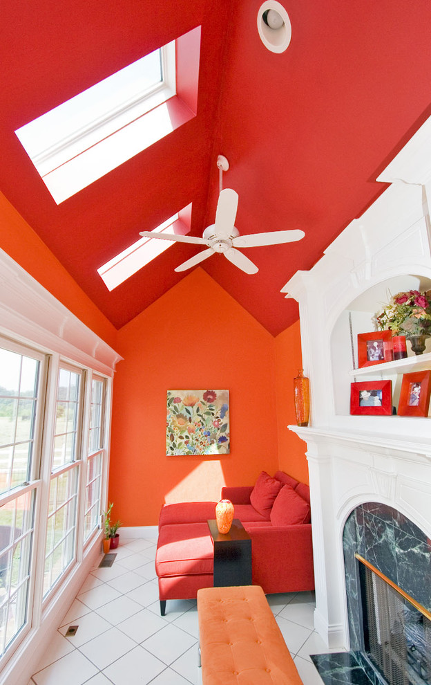
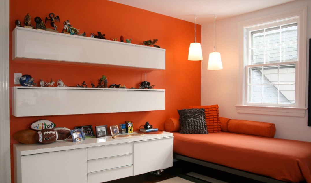
The example illustrates how orange is a powerful interior color. It’s great for kid’s rooms, gaming rooms, living rooms, kitchens, and other spaces.
With modern polychrome decoration, orange is versatile and flexible. The color can be applied in a variety of shades, tones, and hues. However, before we show you our handpicked examples of how orange can transform a room, there is one detail you should know about the color orange.
What Is The Hex Code For Orange?
Just so we’re on the same page, the Hex code for the color orange is #FFA500. This is important to know, especially when you need to order orange paint online from Benjamin Moore, for example.
Colors That Compliment Orange (#FFA500)
Orange Shades
You can also create a room using different shades of muted burnt orange tones. This doesn’t work with the brighter or vibrant shades but does with more subdued choices. {found on tobifairley}.
Aqua Pairings
Aqua and turquoise go along with oranges quite well. It’s a direct contrast and provides a funky, fresh, and retro feel when used throughout a kitchen or a youthful-inspired bedroom.
Crisp and Clean White
A crisp, clean white will complement any variety of orange shades. And when working with bright orange, you’ll get a spacious bedroom.
Happy Yellows
You need yellow to make orange so it’s a natural color to decorate bright orange paint with. Just take this guest room, for example, it’s full of summertime feelings and happy vibes. (gmcbinc).
Black And Dramatic
For a dose of design drama, pair burnt orange with black. It sets the mood for an eclectic and fashion-forward space with an added edge. You could try a vibrant orange with a darker shade like purple if you wanted to make an impression.
Lighter Yellow Orange
A creamy white is neutral with a dash of yellow, and what we’ve learned is that yellow is a parent of orange, making the cream color a perfect compliment to orange shades.
Blushing Pink Combos
Red and white make pink, and red is a parent of orange, pink is a sister to orange. Keep it in the family, throw in some darker orange accents, and watch your space explode with positive vibes. And that just means these two colors can dance together in a bedroom quite well.
Dark Blue And Orange
Blue shades contrast with orange hues, which help them compliment the bright tones. This is an example of perfect orange and royal blue. It captures the necessary design elements for a stylish living space.
Warm Red With Orange Accent
Be bold with your choices and combine your favorite shade of orange with a red that’s just as vibrant. Just like yellow, without red, you can’t have orange.
Extra Orange Ideas
We couldn’t stop at ten. With all the various shades of orange, we thought we’d include a few more to inspire your next room makeover.
Robust Orange
Orange and warm red are strong colors, but that doesn’t mean you should let them intimidate you. Yes, they’re powerful and saturated in certain forms but they might look better than you expect them to.
A strong color can look amazing on an accent wall and can help to bring out the other colors when you mix red or anything else. (courtneykleemandesign).
Orange Hues
There are certain rooms in a home where we’re often reluctant to use strong colors. The bathroom is one of them. That’s exactly why it can be refreshing and invigorating to go a different route. Unexpected colors are often inspiring. {audinoconstruction}.
Lighter Yellow Orange
As mentioned before, choosing neutral and simple colors for the walls, ceilings, and the large surfaces allows you to add color to a room in other forms. You can create interesting focal points with furniture and decorations.
Burnt Orange
Complementary colors like blue and orange look nice together. They bring out the beauty in each other and they contrast with one another but don’t clash. These are consecrated combinations so you can’t go wrong with them. {sukdesigngroup}.
Orange Accent
How about just pure white for a room? This is a very underrated color, one which we often take for granted. White is a powerful color and a good decor base.
Smaller accent colors, materials, finishes, or textures can enliven an interior space. {vinci-hamp}.
Primary And Secondary Colors
Using two strong and different colors in the same room can seem much but not if they’re balanced and make sense. If you’re going with two strong accent colors, the base colors for the walls should be simple and neutral, like a faint shade of beige. {christopherleefoto}.
Orange Shabby Chic
When planning an interior design project, consider the style and theme of the room. If you’re decorating a beach house, you can paint the walls the color of sand and add accent hues like turquoise and blue to complement them.
Orange Accents
The color of your walls should follow the color chart. For instance, if you want to make a space look larger, place your furniture next to the walls, and make sure they’re the same color so they blend into the space. Using light colors is a given in such cases. {thevsigroup}.
How To Choose Paint Colors
The easiest form of color decoration is monochromatic. This is where one color is used or where several tints of the same color are applied to one space. The color that you choose for the wall paint is important in each and every room.
The color of the walls and ceiling tell a story, and induce warm feelings. Here are a few tips to help you choose the right color for your next interior remodel.
Find Inspiration
One of the first things we ever do when we have an idea about a task or a project is to look for examples and inspiration of how other people did similar things. If you’re trying to find a color that suits your home, check out some catalogs, and magazines or look for inspiration online.
There are apps that help you in that regard and a bunch of blogs or web pages specialized in offering particularly this sort of advice.
Color Palette
Color theory explains how different colors relate to each other, how they influence one another, and helps you put together a combination that suits your styles and helps you convey a certain idea or concept.
It would be helpful to check out the basics and learn a few things about this with this occasion. You can then use the information you’ve learned to put together a custom color palette and come up with more ideas and details for your design.
Favorite Print
The inspiration for the color palette of a room can come from anywhere, even from a tiny piece of fabric. Let’s say you have a nice little throw pillow.
Nature Inspiration
Nature is an amazing source of inspiration for literally anything. It’s especially helpful to look outside for inspiration if you want to create an interior design that mimics the outdoors or that uses natural materials. Look in nature for the way in which these particular materials occur alongside others and check out how the colors are combined.
Art Intuition
Another great source of inspiration is art and paintings in particular. Painters spend time studying color theory and combining different colors for their creations to convey the message that they have in mind.
You can find a painting that tells a story that speaks to you and model your interior design after that.
Neutral Colors
With so many different vibrant colors to choose from, we tend to forget about neutrals. It’s easy to dismiss them on account of being too simple or boring when you don’t know how they work.
Variations And Nuances
If your base favorite color doesn’t seem to work for the space that you have in mind, don’t give up just yet. It might be that you simply haven’t used the right shade. Sometimes a lighter or a darker shade of the same color can completely change the way a room looks and feels.
Sample Colors
This is important regardless of the colors you choose. There are more factors to consider than just the actual color of the paint, such as lighting for example. It really helps to bring home some samples and see how those colors actually look on that particular wall in that context.
FAQs
What Is Color Saturation?
Saturation refers to a color’s intensity. For example, when the color black is saturated, the shades of gray leading to white represent lower saturation levels.
What Color Do Blue And Orange Make?
When orange is mixed with blue it creates brown. Orange is a secondary color, while blue is the only primary color within the color spectrum, which is why it’s so unique.
Which Religion Is Orange Associated With?
Orange is a main color of Hinduism. The color has long represented fire and purity. In Indian cultures, the color is considered good luck.
What Is The Biggest Selling Benjamin Moore Orange Paint Shade?
Blaze orange (#ff6700) is one of the biggest selling orange paint shades within the Benjamin Moore catalog.
When Was The Color Orange Invented?
According to historical records, the color yellow-red was named “orange” in the 16th century.
Colors That Make Orange Conclusion
The contradiction within interior design is how everyone claims to love color, yet most people are afraid to use any color other than white. What could be more boring than a white room? As studies have proven, orange interior walls can have a positive impact.
When color decoration is applied sparingly, it has a spotty effect that feels artificial and disingenuous. It’s not until you realize this that you can begin to paint a room.