Waterloo from Sherwin Williams is an Unexpected Chic Paint Choice


Waterloo from Sherwin Williams is bold blue paint color, perfect for many styles of decor. It fits with classic traditional interiors and is just as good to make a statement in a contemporary home.

It creates just enough drama that it commands plenty of attention.
What Color is This Sherwin Williams Paint?
Waterloo (SW9141) from Sherwin Williams is, as you can see, a dramatic paint color. It calls to mind the depths of dark water and is great for many spots in a house.
You can add a bold accent wall to a living room, paint a whole bedroom or spruce up the color of your kitchen cabinets.
This paint from Sherwin Williams has a Light Reflectance Value (LRV) value of 13, which is quite low. On the LRV scale, the higher the number, the more reflective it is. Hence, Waterloo will absorb a lot of the lightness in a space. This is the reason that some people prefer not to use it in a small space.
Altered States

Paint colors vary and take on different characteristics in different types of lighting. This is why it’s very important to paint samples in a specific area to see the true color in your space.
If you paint the walls of a brightly lit area with Waterloo, it will appear lighter and brighter. If the window faces the west or south, the color will appear lighter with the warm sunshine coming in.
By contrast, in a small or dark space, this Sherwin Williams hue takes on a darker tone. In some projects, such as a bathroom without a window, it can look almost black. If your room faces north, the weaker sunlight will bring out the paint’s saturation and the actual color.
Although Waterloo is a blue paint color, it does have some undertones that have a bit of green. This is important to keep in mind when choosing other pieces to go in the room.
Matching Sherwin Williams Paint Colors
Projects using Waterloo have a lot of options when it comes to complementary colors. You can go for lots of contrast, or, you can stick to monochromatic color palettes.
Monochromatic Color Palette

If you go this route, you’ll find a range of lighter tones that can create plenty of drama. And, in some cases, perhaps even more visual interest. Some of the go-to colors for this include Debonair (SW 9139), Moscow Midnight (SW 9142) and Blustery.
Contrasting Color Palette

For some high contrast, you can always go with crisp white paint. For a warmer feeling, stick with a pale warm gray like Rhinestone (SW 7656).
Or, opt for something more colorful and warming, like soft peachy tones. Good matches are Malted Milk (SW 6057) and Warming Peach (SW 6338).
Similar Colors from Sherwin Williams
Although you might find colors that initially look the same, each hue has different undertones and reflects different levels of light in various rooms.
If Waterloo is not quite right for your painting project, there are a couple of other similar-looking paint options from Sherwin Williams.
Needlepoint Navy (SW 0032)

This color of paint has the same LRV of 13 that Waterloo does, it also has a dark appearance. However, the green and gray undertones are more dominant.
Smoky Blue (SW 7604)

Sherwin Williams color SW 7604 is a tiny bit more reflective than Waterloo, with a rating of about 14.7.
As the name implies, this paint looks a little grayer. Stick with this one if you’re working with an area that already has a good amount of gray.
Ideas for Painting With Waterloo
If you think that Waterloo might be the right hue for you, here are some inspiring ideas for ways to use it.
Chic Media Room

The depth of color that Sherwin Williams Waterloo offers is terrific contrasted with white. You can see how sophisticated it looks in this Portland home’s media room.
The white trim really highlights Waterloo and makes the alcove stand out.
Natural wood furniture brings a good deal of warmth.
Moody Master Bedroom

How fabulous is this master bedroom with walls painted in Waterloo? The contrast of the white ceilings highlights the deep paint color.
Keeping everything else in the bedroom, including the bedding, furniture and drapes, to a monochromatic color scheme makes it even more dramatic.
Exterior Accents

When you use Sherwin Williams Waterloo for exterior accents, it becomes obvious how daylight changes the nature of this color.
The garage door, front door and trim exhibit more green undertones thanks to the brighter light. The color looks quite different from the moody master bedroom.
Dark Wainscoting
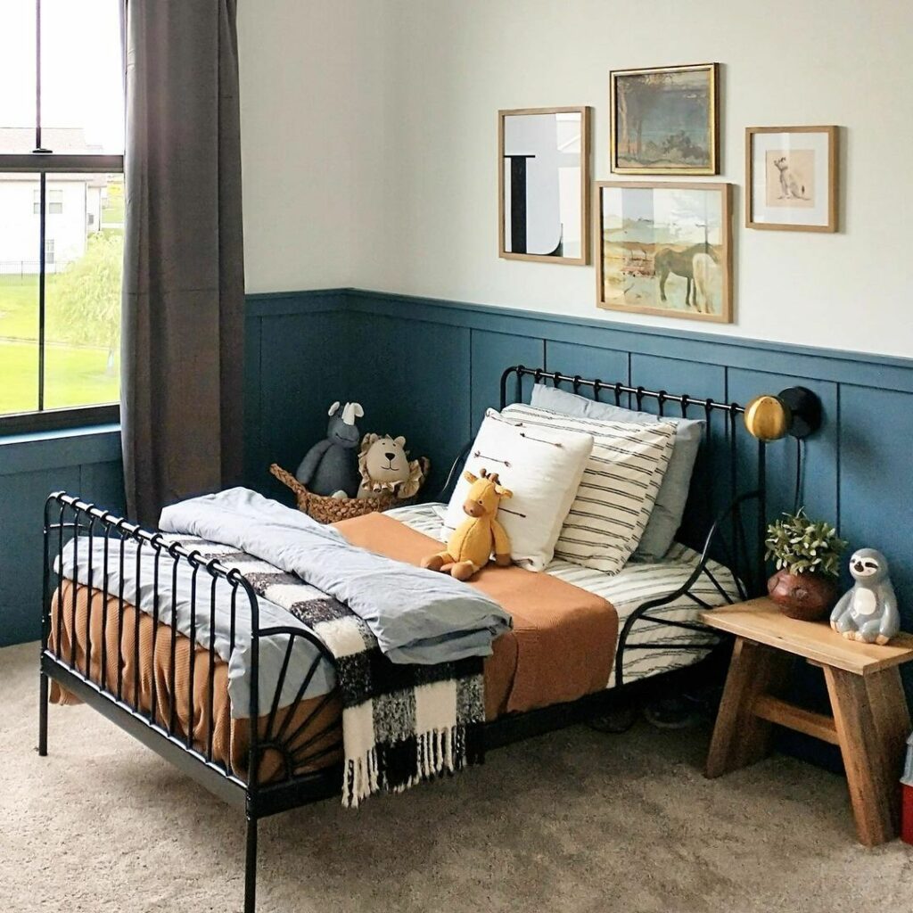
Instead of the usual white wainscoting and dark walls, this bedroom has the opposite. The bottom of the wall is painted in Sherwin Williams Waterloo. This can help hide the mess that kids can make of the wall.
Creamy white and earthy-colored accessories give this bedroom a very warm, cozy feeling.
Bold Bathroom Vanity

This bright bathroom skips the walls and puts Waterloo on the vanity cabinet instead. There’s high contrast from the soft beige paint and white trim.
The tile details around the mirrors adds even more contrast and a lot of visual interest.
Multifunctional Style

Painting with Waterloo and adding some white trim makes rooms ready for anything. This stylish area serves as a home office and a playroom. It’s bright and cheery, without going overboard.
Painted Kitchen Cabinets

Painted kitchen cabinets are still trending and Waterloo is a great color for doing this. This homey kitchen uses the Sherwin Williams paint for the bottom cabinets and the island while leaving the top cabinets white.
Entryway Drama

Painting the front door on the exterior is commonplace, but not so on the inside. Here, you can see what a dramatic difference it makes to paint the interior of the door. This ties it in with the bottom of the wall, which is also done in Sherwin Williams Waterloo.
Bedroom Retreat

Dark colors like Sherwin Williams Waterloo can still be calming in a bedroom setting. This example pairs the deep color with creamy painted furniture and neutral bedding and upholstery.
Frequently Asked Questions (FAQ)FAQ
What color goes with Waterloo?
Lots of colors pair well with this Sherwin Williams color. Try putting it with shades of gray, different white tones, off-whites, greiges, mustard yellows, and warm peachy colors.
What is the most popular Sherwin Williams blue?
The company’s most popular shade is not Waterloo. It is Sherwin Williams Naval (SW 6244). It was the color of the year in 2020.
Is there a warm blue paint color?
Most people think of it as a cool color but there are some shades that feel warm. A choice that has yellow undertones is what you’re looking for.
Is blue colour good for living room?
Using blue in living rooms has a calming effect on the house. It’s also a very versatile shade. Besides, it’s one of America’s favorite colors.
How do I incorporate blue into my living room?
The easiest way is to paint. First, however, choose the vibe you want to create. Go moody with colors like Waterloo or crate a lighter feeling with bright and beachy blues. Or, just add decor and details to neutral living rooms.
Conclusion
Waterloo is a much more versatile color than you might think. Paint some samples and give it a try.
Your biggest decision is whether to use it as an accent or the main wall color. In either case, it’ll help create a very sophisticated room.