Muted Colors: Enhancing Designs with Subtle Hues


Muted colors have low saturation levels, making them understated and subtle. They are a combination of a base color mixed with white, gray, or black to reduce the intensity.
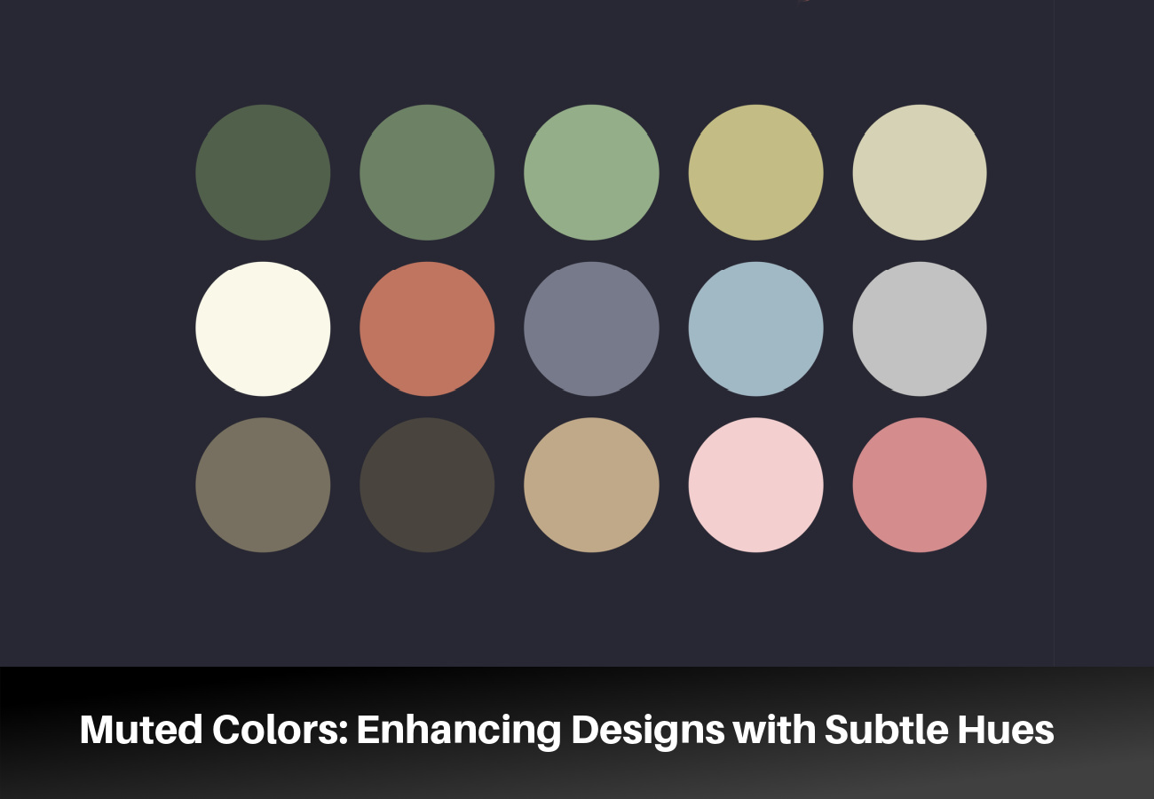
They range from soft pastels to deep, rich earth tones. Muted color palettes enhance a design’s visual appeal without overwhelming the observer.
The Role of Muted Colors in Design
Muted colors offer several perks that enhance the impact of a design project.
- Enhancing visual hierarchy: Muted colors allow more vibrant elements to stand out, guiding the viewer’s eye through a design.
- Creating balance: Using muted colors balances bold and vibrant colors. It allows designs to become manageable while maintaining a cohesive aesthetic.
- Evoking emotion: Color symbolism associates specific colors with meanings and emotions. Muted colors tend to evoke calm and subtle emotions. These emotions set the tone or mood for a design and brand identity.
- Increasing readability: To improve readability, designers use muted colors as backgrounds or text. Muted colors help make information clear and easy to understand.
- Supporting minimalism: Muted colors complement minimalist designs, allowing for a clean, uncluttered appearance that emphasizes function and simplicity.
How to Identify a Muted Color
These characteristics help identify a muted color:
Lower Saturation
Saturation is the intensity of purity of a color. Muted colors have less pure color or hue. Colors with a lower saturation appear more subdued and less intense.
Presence of Neutrals
Muted colors often blend the original hue and neutral colors such as gray, white, or black. The combination results in a less vibrant combination. For example, adding gray to pure red creates a muted, dusty rose color.
Tints and Shades
Adding white or black to a pure hue also creates muted colors. The combination results in tints (lighter) or shades (darker) of the original color. These variations often have a softer, more understated appearance than the saturated base hue.
Earthy or Pastel Tones
Muted colors resemble earthy or pastel tones since they have lower saturation levels. Natural elements like solids, rocks, or plants create earthy tones. In contrast, mixing a pure hue with a substantial white creates pastel tones.
The Impact of Overusing Vivid Colors
Overusing vivid colors may have some effects on a design’s aesthetic.
1. Loss of Hierarchy and Contrast
Balancing the contrast guides the viewer’s eye through the design. Too many vivid colors disrupt the visual hierarchy. The loss of hierarchy and contrast makes distinguishing primary and secondary elements in a design difficult.
2. Ineffective Communication
Vivid colors that dominate a design may overshadow its intended meaning. Clashing vibrant colors distract the viewer from the content, undermining a design’s communication goal.
3. Visual Overstimulation
Visual overstimulation is often a result of overusing vivid colors. The impact makes it challenging for a viewer to focus on the critical elements of a design. Intense colors may create an overwhelming appearance, leading to eye strain and discomfort.
4. Negative Emotional Response
Since vivid colors evoke strong emotions, overusing them elicits unwarranted emotional responses. For instance, excess intense red tends to evoke feelings of aggression, and an overload of bright yellow creates a sense of anxiety.
Muted Colors in Fine Art
In fine art, muted colors achieve specific effects and convey certain emotions.
- Mood and atmosphere: Muted colors evoke a sense of subtlety in an artwork. They allow the viewer to reach a deeper emotional level by creating a reflective atmosphere.
- Realism: Realistic paintings use muted colors since they resemble natural colors. Artists use muted colors to depict scenes while capturing the subject matter’s essence accurately.
- Historical context: Muted colors were used in historical art movements, such as the Renaissance or Baroque periods. They create a sense of depth and realism. Muted colors may have been a practical necessity when pigments were scarce.
- Contrast and balance: Muted colors often provide visual balance when used with more vibrant hues. The balance creates harmony within the compositions. It also directs a viewer’s focus to specific areas of the artwork.
Muted colors also carry symbolic meanings in fine art. For instance, earthy tones symbolize a connection to nature. In fine art, muted blues evoke a feeling of calm or solitude.
Muted Color Palettes That Work in Any Space
1. Earth Tones
An earth-toned color palette draws inspiration from nature. Earth tones color include muted greens, terracotta, soft browns, and beiges. The palette creates a comforting atmosphere suitable for living rooms or dining areas.
Key Palette Components:
- Base colors: Warm gray, light beige, or cream
- Accent colors: Sage, terracotta, or muted olive green
2. Soft Pastels
Soft pastels are best for bedrooms and bathrooms, providing a calm and peaceful environment. Pastels are also ideal for spaces with enough natural light since they enhance the airy, open feel.
Key Palette Components:
- Base colors: Soft lavender, blush pink, or powder blue
- Accent colors: Baby pink, mint green, or pale yellow
3. Cool Neutrals
Cool neutrals offer a modern aesthetic to any space, from home offices to contemporary kitchens. The color palettes often include soft black, white, or gray shades. They’re easy to complement with subtle cool-toned accents for extra depth.
Key Palette Components:
- Base colors: Soft black, white, or light gray
- Accent colors: Slate gray, cool blue, or silver
4. Warm Neutrals
A warm neutral palette features colors like beige, soft white, and taupe. They’re easy to pair with complementary warm-toned accents.
Key Palette Components:
- Base colors: Warm beige, soft white, or taupe
- Accent colors: Burnt orange, warm brown, or goldenrod
5. Muted Jewel Tones
Muted jewel tones offer a more subdued effect on bold, vibrant colors. The palette adds a touch of elegance to dining rooms or master bedrooms.
Key Palette Components:
- Base colors: Dusty amethyst, soft emerald, muted sapphire
- Accent colors: Faded ruby, warm gold, smoky topaz
Tips for Choosing and Mixing Muted Colors in Home Decor
- Consider the mood you want to create: Muted colors create different moods depending on the color and the saturation. Soft blues and greens evoke a sense of calm and serenity. Muted yellows and oranges add warmth and coziness.
- Limit your color palette: Choose two or three muted colors and use them throughout your decor for a cohesive look.
- Use contrasting shades: Mix lighter and darker shades of muted colors to add contrast and depth to your decor. For example, pair a light gray wall with a darker gray sofa to create a cohesive, muted color scheme.
- Use different patterns and textures: Mixing muted colors with patterns creates a playful and appealing aesthetic. Try muted florals, stripes, and geometric patterns.
Top Considerations When Creating a Muted Color Palette
- Consider the medium: Consider the display medium of your design, such as print or digital.
- Incorporate vibrant hues: Muted colors can appear flat and dull. Adding solid, vibrant colors to the design is essential.
- Use color families: For instance, a muted blue palette could contain muted blues or purples.
- Warm vs. cool colors: Warm muted tones include nude, bronze, and caramel. Mint green and bluish pink are cool, muted colors.
- Color symbolism: Colors evoke different emotions and moods. Muted greens have a calming effect on viewers since they are reminiscent of nature.
Practical Applications of Muted Colors in Various Design Fields
Muted color palettes are essential in graphic design, web design, and fashion.
Graphic Design
Muted colors create a unique palette for branding and print advertisement. Subtle browns and off-white are often used as background colors. The subtle hues make reading texts on the design easier.
Pairing muted colors with bright colors gives the design a dynamic and eye-catching effect. Casper and Asana use muted colors slightly lighter or darker than surrounding colors for illustrations.
Web Design
Muted colors are easier on the eyes, which improves the user experience. They’re used for buttons and links, text, and typography. Using a muted tone of the website’s primary color as a background is also ideal.
Muted color schemes are also ideal for product design in combination with vivid accents.
Fashion Design
Soft blues, greens, grays, and taupes are popular choices for muted clothing colors. The colors are versatile and create a sophisticated, timeless look. They’re also used in accessories such as bags, jewelry, and shoes.
Case Studies of Successful Muted Color Designs
Artwork
“The Potato Eaters” (1885) by Vincent van Gogh uses earth colors in the composition. The colors symbolize the harsh realities of country life- ‘something like the color of a really dusty potato, unpeeled, of course.’
Product Design
MacBook and iPhone designs feature muted gray, silver, and black tones. It gives them a sleek and sophisticated look.
Website Design
LinkedIn combines cyan blue with shades of gray as their primary website colors. Their accent palette includes purple, red, and orange.