Color In Architecture – A Fascinating Combo

We’re living in a world full of color and even though we may not be as well-equipped to distinguish between all the subtle nuances we definitely enjoy playing to them and experimenting. Color is everywhere and without it, nothing would be the same, not even the buildings that you walk by every day. Sure, a lot of them are boring and neutral-colored but there are also a lot of cool-looking structures that stand out. The role of color in architecture is very important and to prove it we’ve gathered a spectrum of interesting projects for you to take a look at.
Industrial Orange


In 2011 studio Jakob + Macfarlane Architects worked on reinventing the docks on Lyon in France, the goal being to replace the landscape dominated by warehouses and cranes into one that blends architecture, culture and commerce, where the atmosphere would be more vibrant and more modern. The Orange Cube made that happen. As the name suggests, it’s a large cube-shaped building that’s been painted orange, a color reminiscent of the lead paint used on old industrial structures. In this case the color tells a story and creates a strong bond between architecture and history.
Cool Blue


This is an art school located in Burgos, Spain. It was designed and built by Estudio Primitivo Gonzalez in 2011 and has a very curious appearance. The ground floor of the school is black and the upper section (the most noticeable one) features this deep blue shade which makes it stand out and look very vibrant but which also allows the building to blend into the clear blue sky. It’s a cool color but a building designed to nurse creativity.
Vivid Red


Red turned out to be the perfect color for the new Regional Blood Center building in Raciborz, Poland. The building was designed by studio FAAB and is finished with ceramic tiles in three different shades of red, a little detail which creates an irregular pattern meant to make the structure even more vibrant and eye-catching. The red color was chosen because of its correlation with blood, making a statement on more than one level.
Stylish Pink


An old stable dating back to the beginning of the 20th century was converted into a contemporary house by Mezzo Atelier in 2017. The structure is located in Ponta Delgada, Portugal. One of the most noticeable and most effective changes has to do with the color of the facade. The entire building is painted in a vibrant but also soft and pleasant shade of pink. This new look gives the house a contemporary vibe, in tone with it’s brand new and reimagined interior design.
Vibrant Green


The Herzberg development is a project completed in 2011 by studios AllesWirdGut Architektur and feld72. The development brings together a variety of residential structures, becoming its own neighborhood complete with all necessary facilities. The building are terraced which gives each floor a different vibe while also affecting the layout. The facades have been painted in gradient green, featuring stripes with different intensities of this fresh color, starting from a rich green shade at the bottom and ending with a crisp white section at the top.
Surreal purple


Purple is a sophisticated and chic color with a lot of character. In the context of the Purple Hill House designed by IROJE KHM Architects its role is to emphasize the seamless connection between the building and its natural surroundings. It’s not just the color that helps the house blend into the landscape but also the overall shape and design which mimic the hill and surrounding landscape. At the same time, the different shades of purple create this surreal vibe which suits the house perfectly, especially considering its unique design and unusual interior floor plan structure.
Cheerful Yellow
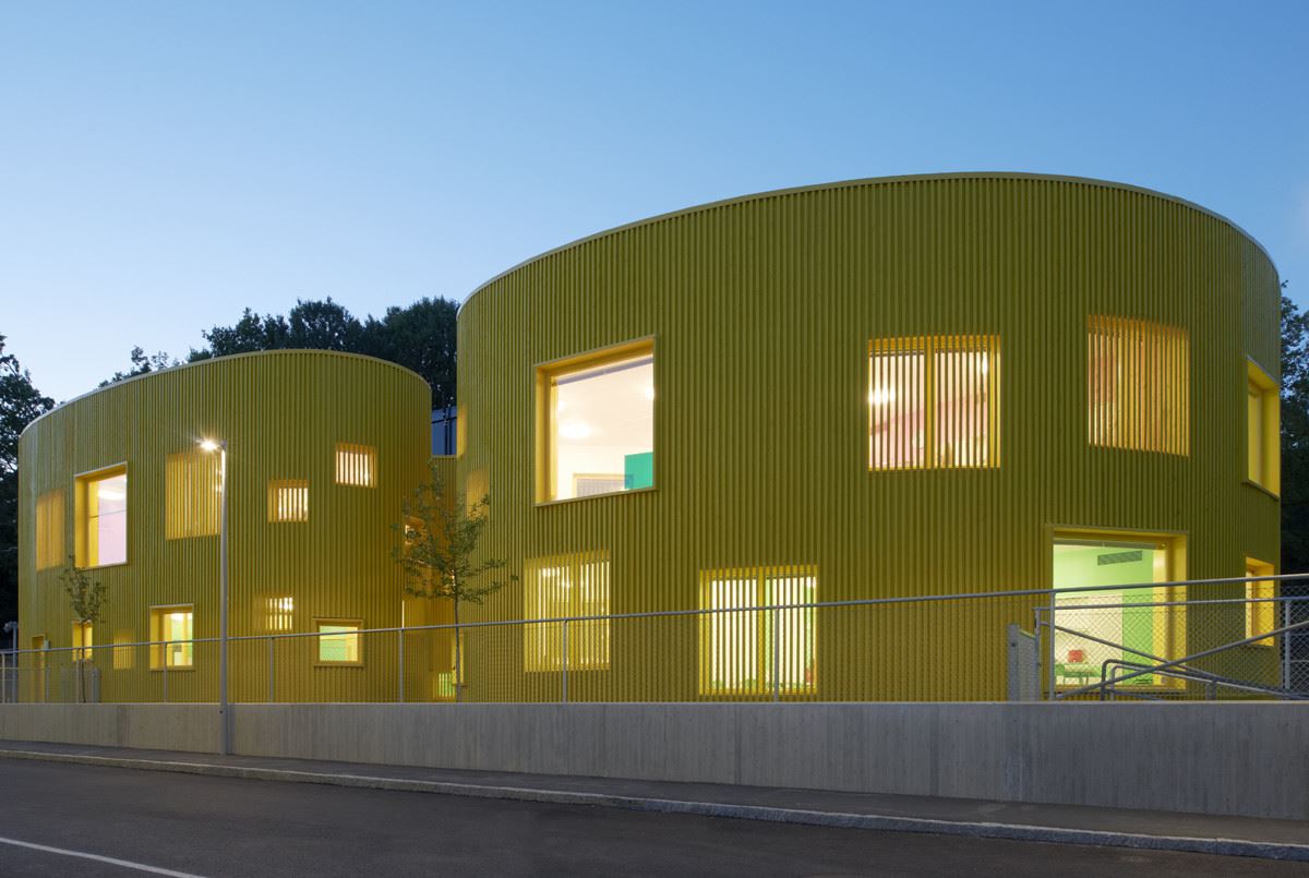

This cool-looking building is the Tellus Nursery school located in Stockholm, Sweden. It was designed by Tham & Videgård Arkitekter and completed in 2010. It has an unusual form, undulating like a ribbon which makes it intriguing, eye-catching and also playful. The bright yellow exterior puts emphasis on the cheerful and playful nature of the design. The windows are positioned at different heights so the little ones can reach them too and some of the windows are hidden beneath the facade.
Earthy Brown


This is a house inspired by the desire to blur the boundaries between nature and architecture and to create something that’s simultaneously natural and man-made. It’s a project conducted by Randy Brown Architects. The house is located in Omaha, United States, on a sloping site with views to the West and South and a forest unfolding behind it. It was constructed using green building techniques, including passive solar energy, natural ventilation and a green roof system. In addition to that, renewable materials have been used throughout the project. The brown patina of the exterior walls helps the house blend into the landscape.
Black


Black is classic and never really goes out of style and that is also true for buildings. Of course, as cool and mysterious as an entirely black building may seem sometimes an accent color can really bring out the character in that place even better. This structure for example is an apartment building designed by Metaform Architects. It’s minimalist but also vivid and dynamic thanks to the colorful panels, bringing architecture and art together in a very original way. It’s a really cool way to express creativity without going overboard.
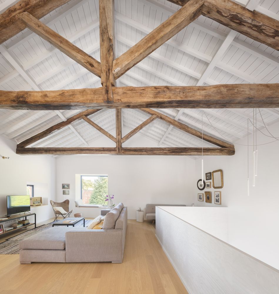
Pure white


White is not as common as you probably think when it comes to buildings and their facades. A white house can thus stand out and this is, in fact, a perfect color for structures with quirky architectures and designs. This house in South Korea is an interesting example. It was designed by Architects Group RAUM for a young couple who wanted something different, something special but enjoyed the city life. This is a sort of hybrid between a suburban house and a city apartment. The white exterior allows it to blend in but also allows the geometry of the design to stand out more.