Upper Kitchen Cabinets in 2026 Why Designers Are Removing Some but Not All

Want a kitchen that feels open without losing storage or structure? In 2026, upper cabinets are no longer treated as a default layer that fills every wall. The shift isn’t about removing them completely. It’s about deciding where they actually make sense and where they start to work against the space.
What’s changing is simple. Instead of continuous rows of cabinetry, kitchens are becoming more selective. Some areas stay closed and functional. Others open up, breathe, and let materials, light, and layout take over.
These kitchens show exactly how that balance is working now.
Open Shelving Replaces Cabinets Around Windows

This setup removes upper cabinets exactly where they would block light the most. Instead of forcing cabinetry around the windows, the design opens that wall completely and replaces storage with slim floating shelves.
The shelves are not trying to hold everything. They carry only everyday pieces. Glassware, bowls, and a few objects. That keeps the wall light and usable without turning it into clutter.
What stands out is how the window becomes the focal point. The kitchen feels wider, brighter, and more connected to the outside, simply by removing cabinetry in the right place.
Full Cabinet Walls Still Handle Heavy Storage

Not everything is open. This kitchen shows where upper cabinets still make sense.
Tall cabinetry, integrated ovens, and closed storage are grouped into one solid wall. This concentrates the bulk and keeps the rest of the kitchen cleaner.
Instead of spreading cabinets everywhere, storage is stacked vertically in one zone. That creates a clear structure. One wall works hard. The others stay lighter.
This is the new balance. Not less storage, just better organized storage.
Color and Form Replace the Need for Upper Cabinets

Here, upper cabinets exist, but they don’t dominate the space.
The bold green cabinetry and sculptural hood create enough visual presence that the wall doesn’t need to be filled with storage. The design uses fewer cabinets but stronger elements.
The result feels intentional. The kitchen isn’t relying on repetition. It’s built around focal points.
Removing cabinets works when something else takes their place visually. Color, shape, or material needs to carry that weight.
Mixed Upper Cabinets and Open Sections Create Rhythm

This kitchen doesn’t choose one approach. It mixes both.
Closed cabinets sit next to open cubbies, creating a broken line instead of a continuous block. That small shift changes how the wall feels. It becomes more dynamic and less heavy.
Open sections are used for items that benefit from visibility. Closed ones hide everything else.
This works because the contrast is controlled. Nothing feels random. The pattern is intentional and repeated across the wall.
Minimal Upper Cabinets Keep the Focus on Materials

In this setup, upper cabinetry is reduced to the minimum.
What takes over instead is the material palette. Stone backsplash, wood cabinetry, and integrated lighting define the space. The wall is not filled because it doesn’t need to be.
The fewer cabinets you use, the more every remaining surface matters. Materials have to carry the design.
This is where many kitchens fail. Removing cabinets only works when what’s left is strong enough to hold attention.
Classic Kitchens Still Use Upper Cabinets — But More Selectively
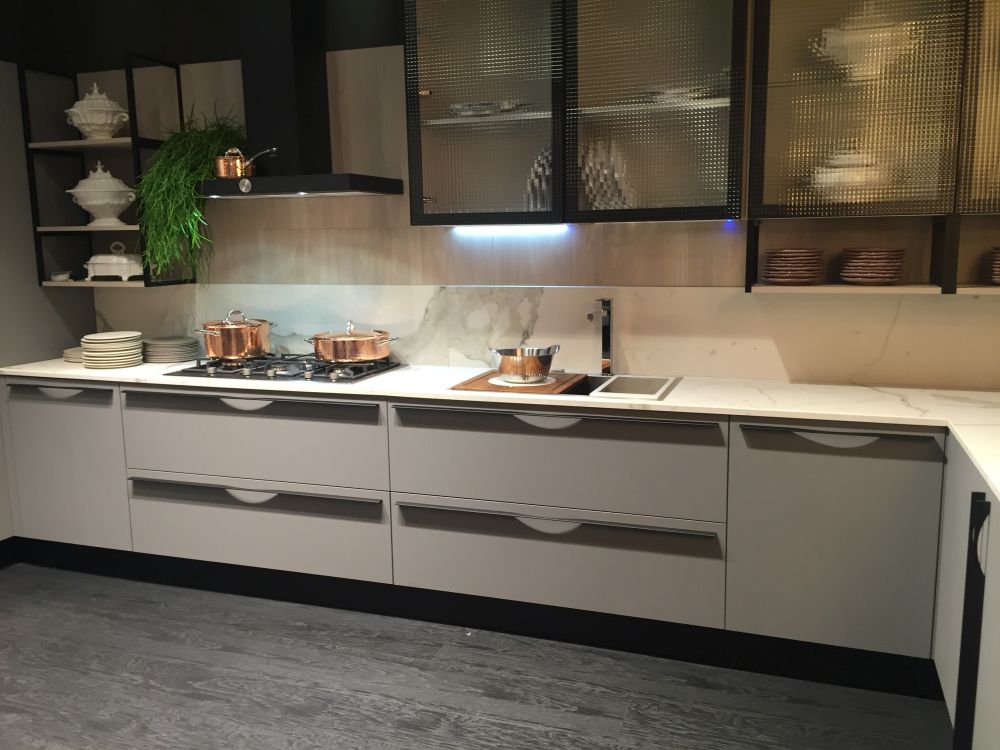
Traditional kitchens aren’t removing upper cabinets completely. They’re refining how they’re used.
Here, glass-front cabinets and open sections break the heaviness. Instead of solid doors across the entire wall, the cabinetry becomes lighter and more detailed.
Even in classic styles, the goal is the same. Reduce visual weight without losing function.
This shows that the shift is not about modern vs traditional. It’s about balance.
Integrated Designs Hide Upper Storage More Cleanly

This kitchen keeps upper cabinets but integrates them so they feel less visible.
Flush fronts, darker tones, and continuous lines make the cabinets blend into the wall instead of standing out. Open shelving is used in small sections to break the surface.
Lighting also plays a role. Under-cabinet lighting highlights the working area and shifts focus away from storage.
The cabinets are still there. They’re just not the main feature anymore.
Where This Trend Actually Works
Removing upper cabinets works best when:
- There is enough base storage to compensate
- The kitchen has natural light worth exposing
- Materials and layout are strong enough to carry the design
- Open areas are kept controlled and not overloaded
Where it fails is just as clear:
- Small kitchens that rely on every inch of storage
- Clutter-heavy households
- Walls with no visual alternative once cabinets are removed
The Real Shift
This isn’t about choosing between open shelving or upper cabinets.
It’s about understanding that not every wall needs to be filled.
In 2026, the best kitchens are not the ones with the most storage. They’re the ones where storage is placed exactly where it makes sense, and removed everywhere else.