What Is a Color Wheel?


The color wheel illustrates how colors interact in real-world aspects such as design, fashion, or visual art. Designers, artists, and painters use the color wheel to understand the basics of color theory and choose color combinations.
What Is a Color Wheel?

A color wheel is a visual representation of how different colors relate. The wheel is circular, with primary colors–red, blue, and yellow positioned at equal distances around the circumference. The primary colors are also known as the “pure” or “unmixed” colors. Mixing primary colors creates secondary colors.
For instance, when blue and yellow mix, they create green, a secondary color. When primary and secondary colors mix, they create tertiary colors. Combining red and orange, for example, creates the tertiary color “red-orange.”
Complementary colors face each other’s opposite directions. For instance, red and green colors are complementary colors. When both colors mix, they bring a sense of harmony and balance. The color wheel also helps identify analogous colors. Analogous colors appear next to each other on the wheel.
History and Development of the Color Wheel
The color wheel was Sir Isaac Newton’s idea. In the seventeenth century, Newton used seven colors to demonstrate their relationship. The colors were red, orange, yellow, green, blue, indigo, and violet. He arranged the colors in a spectrum from light to dark, each with a number.
In the eighteenth century, Johann Wolfgang von Goethe introduced a color wheel with 12 colors. Each of the seven colors had its complementaries. When complementary colors mix, they create a contrasting effect.
The conventional color wheel is based on Newton’s seven original spectrum colors. Today, the arrangement of the colors is known as the RYB color system. It’s the standard unit for illustrating color relationships in artistic projects since the eighteenth century.
The color wheel splits warm colors like red and yellow from cool colors like green and blue. It influences most color schemes in design.
#FF0000
(255,0,0)
(255,128,0)
#FFFF00
(255,255,0)
(128,255,0)
#00FF00
(0,255,0)
(0,255,128)
#00FFFF
(0,255,255)
(0,128,255)
#0000FF
(0,0,255)
(128,0,255)
#FF00FF
(255,0,255)
(255,0,128)
Color Wheel Categories
The color wheel splits into three categories—primary, secondary, and tertiary, with some sub-categories within each.
| Color Wheel Category | Colors Included |
|---|---|
| Primary Colors | Red, Yellow, Blue |
| Secondary Colors | Green, Orange, Purple |
| Tertiary Colors | Yellow-Orange, Red-Orange, Red-Purple, Blue-Purple, Blue-Green, Yellow-Green |
| Warm Colors | Red, Orange, Yellow |
| Cool Colors | Green, Blue, Purple |
| Neutral Colors | Gray, Black, White, Brown, Beige |
| Complementary Colors | Colors that are opposite each other on the color wheel, such as Red and Green, Blue and Orange, Yellow and Purple |
| Analogous Colors | Colors that are adjacent to each other on the color wheel, such as Red, Orange, and Yellow |
| Triadic Colors | Three colors that are equally spaced apart on the color wheel, such as Red, Yellow, and Blue |
| Monochromatic Colors | Variations of a single color, such as light blue, medium blue, and dark blue |
Primary Colors
The primary colors are red, blue, and yellow. These three base pigments (RYB) help create other hues. They’re in the middle and spaced out to form a triangle.
Secondary Colors
Primary colors mix to form secondary colors like orange, green or purple. These blended versions of the primaries surround the primary color triangle.
Tertiary Colors
Tertiary colors are a combination of both primary and secondary colors and are between primary and secondary colors on the color wheel. Tertiary colors include red-purple, yellow-orange, blue-green, and more.
Common Color Wheel Mixing Models
The primary color wheel mixing models are the additive, subtractive, and RYB color mixing models.

The Additive Mixing Model
The additive mixing model is the combination of lights at different wavelengths. It creates different colors by mixing the primary colors (red, green, and blue). The model relies on a physics principle. When two waves traveling in the same direction mix, they form a single new wave.
Unlike other mixing alternatives, the additive model doesn’t lose a hue when primary colors combine. Instead, it creates a bolder color when two primary colors blend. The additive mixing model is common in digital imaging technology and lighting.
The Subtractive Mixing Model
The subtractive model is the opposite of the adding mixing model. In this model, when two colors mix, they form a darker shade. They create a black hue when red, yellow, and blue blend.
Traditional and digital artists use the subtractive mixing model to create primary and secondary colors tints. It also helps create natural or subtle color variations in photography and printing.
RYB Color Mixing Model
The RYB mixing model is common. It’s based on both the primary and secondary mixing models. The two models combine to create a variety of blending hues. It was the first mixing model and is still common in digital art.
In the RYB mixing model, when two colors mix, they form tertiary colors. The model produces different shades while painting or editing with Adobe Photoshop.
RGB vs. CMYK
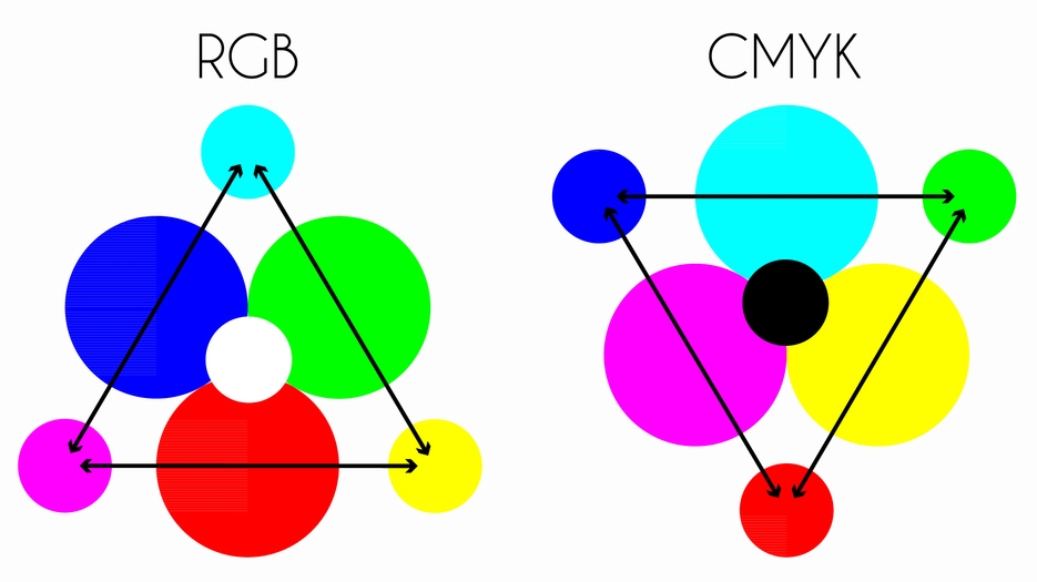
It’s challenging to choose between RGB (Red, Green, Blue) and CMYK (Cyan, Magenta, Yellow, Black) when designing visuals. Both are suitable for print or digital art.
| RGB | CMYK | |
|---|---|---|
| Color Model | Red Green Blue | Cyan Magenta Yellow Key (Black) |
| Color Space | Additive (light) | Subtractive (ink) |
| Primary Colors | Red, Green, Blue | Cyan, Magenta, Yellow |
| Uses | Electronic displays (TVs, computers, phones) | Printing on paper, fabric, or other materials |
| Color Range | Wider range of bright colors | Narrower range, limited by inks and printing process |
| File Formats | JPEG, PNG, GIF, SVG | PDF, TIFF, EPS |
| Transparency | Supports transparency with alpha channel | Must use a separate file or layer for transparency |
| Mixing Colors | Colors are mixed by adding light | Colors are mixed by subtracting ink |
| Gamut | Larger gamut, capable of displaying more colors | Smaller gamut, cannot display some bright colors accurately |
| Color Accuracy | Accurate on electronic displays | Color accuracy varies depending on printer and ink quality |
RGB
RBG is a color mixing model that uses the additive primary colors red, blue, and green. These light colors mix to create other hues. It mixes different intensities of red, green, and blue light on electronic displays.
The color values of RGB exist in a unitless range from 0 to 255. They represent the intensity of a color, with 0 being the lowest.
CMYK
The CMYK color model is ideal for creating color for print. All its four inks–cyan, magenta, yellow, and black, create other colors on a white background. The range of colors when using CMYK is from 0-100%. A value of 100% represents the maximum amount of a single color on the white background.
Which Should I Choose, RGB or CMYK?
RGB is best for digital displays, while CMYK is suitable for printing projects. When converting from RGB to CMYK, their differences impact the appearance of a design. As a result, you may experience a shift in color, vibrancy, and brightness.
Deviating from the CMYK mixing model results in incorrect color matching when printing a project. CMYK, a subtractive color model, creates color by subtracting different levels of each ink. It explains why CMYK images tone down in print.
How the Color Wheel Helps Identify Color Schemes
Color schemes help create a desired visual effect. Illustrators, artists, and designers use the color wheel to identify various color schemes. The color wheel is also part of color theory – the belief that specific colors work best together.
1. Complementary Color Scheme
Complementary color schemes consist of two colors located opposite each other on the color wheel. Complementary colors often have high contrast and include blue and orange, yellow and purple, and red and green.
2. Split-Complementary Color Scheme
The split-complementary color scheme is a variation of the complementary color scheme. It blends a base color along with two colors next to its complement.
An example is using blue as the base color and red-orange and yellow-orange as adjacent colors. The high contrast remains intact but has a more subdued effect.
3. Monochromatic Color Scheme
You need different tints and shades of the same color to make a monochromatic color scheme. It helps create a cohesive, harmonious, yet minimalistic look. Different shades of yellow or blue are common examples.
4. Analogous Color Scheme
The analogous color scheme features colors that are in a group on the wheel. Since it uses colors next to each other, the final color is quite predictable. Some of its variations produce up to five colors.
The analogous color scheme often uses two colors on either side of the base to make up the entire scheme. The scheme uses the same color family and often subdued hues.
5. Triadic Color Scheme
The triadic color scheme uses three evenly positioned colors around the color wheel. The three-color combination produces many hue variations with high contrast. Examples of the color scheme include red, blue and yellow, or purple, green, and orange.
6. Tetradic Color Scheme
The tetradic color scheme combines four colors next to each other on the wheel. It creates a bolder color with more visual interest but can be challenging to balance.
7. Neutral Color Scheme
The scheme uses neutral colors such as beige, black, white, and gray. Neutral colors create a calming atmosphere, but poor balancing makes them monotonous. Mixing neutral colors with a bright accent color creates a more vivid background.