Eye-Catching Coffee Shop Design Ideas That Draw People In


Coffee shops around the world are supplying us with energy and lift our spirits every day. They are not just commercial space but also social gathering areas, perfect for casual and impromptu meetings.

So often we take coffee shop designs for granted and we simply expect these places to be warm and welcoming without stopping to appreciate their design and all the elements which make that possible. Today we make it happen. We’ve gathered below some of our favorite coffee shop designs and we’re ready to share them with you.
20 Unique Coffee Shops That You’ll Want to Visit Around the World
1. A Tiny Takeaway Coffee Shop Hidden in the Street


It would be very easy to miss this tiny takeaway coffee shop if not for its black design with vertical slats which help it stand out from the rest of the structures in the area. The interior measures only 3 square meters. The coffee shop is called “The coffee” and occupies a small space next to a restaurant. It was designed by studio Boscardin.Corsi Arquitetura.
2. A Shanghai Coffee Shop with a Unique Wall Installation


The interior design of this coffee shop from Shanghai was inspired by coffee itself. This was a project completed by architect Alberto Caiola who created a sculptural ceiling with black undulating lines, reminiscent of waves and the vapors of the coffee. The shop also featured an eye-catching wall insulation made with a variety of Moka coffee pots in various sizes.
3. A Bright and Bold Coffee Shop in South Korea


This is the Churro Bunny, a tiny shop in South Korea that serves takeaway coffee and a few other things. It was designed by studio M4 and it looks very cheerful. The bright yellow surfaces make it stand out from the surrounding shops and structures, giving it a cute and friendly look.
4. A Coffee Shop Designed to Connect with Customers and Passers-By


The concept behind the design of this coffee shop from Hong Kong was to connect the customers and the passers-by. The shop is called Elephant Grounds and was designed by James JJ Acuna of JJA / Bespoke Architecture using simple, warm materials and following a modern aesthetic with subtle rustic-industrial vibes.
5. A Warm and Welcoming Coffee Shop in Kiev
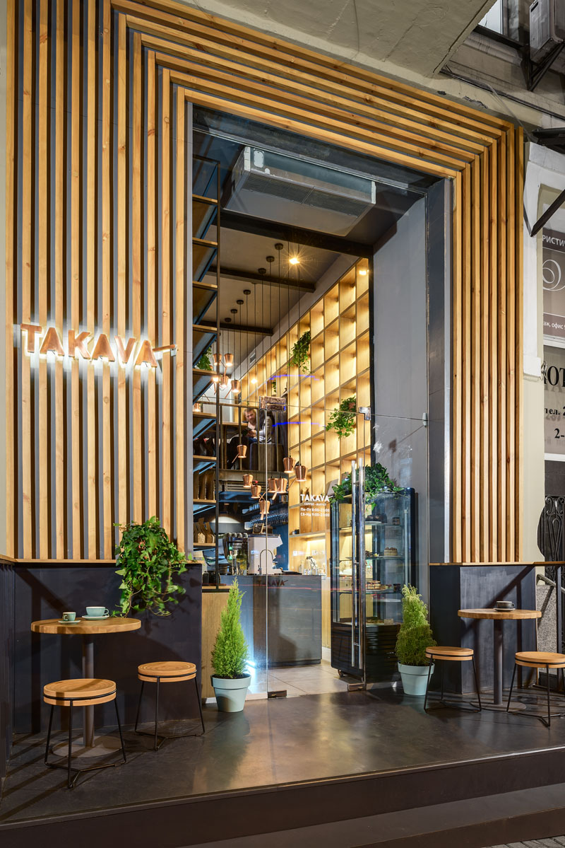

The Takava coffee shop is located in Kiev, Ukraine, and was a project completed by studio YUDIN Design. It’s defined by a warm and welcoming aesthetic with industrial influences. The warm wood facade draws people in while also framing the entrance and emphasizing the height of the space. A key design element is a wooden shelving unit with backlighting that highlights a series of items put on display.
6. A Charming New York City Coffee Shop


Originally just a small alleyway between two buildings, the Happy Bones NYC is a charming coffee shop located in the SoHo neighborhood of New York City. It was designed and built by UM Project in collaboration with Ghislaine Viñas Interior Design. Its interior is simple and inviting, with painted brick walls and exposed beams adorned with display shelves and artwork.
7. A Small Flat Turned Into a Coffee Shop

A lot of small coffee shops started out as something else and this place in Budapest is no different. This was originally a ground floor flat in a building dating back to 1812. The transformation was a project done by sporaarchitects and it revealed some of the building’s beautiful original features such as the vaulted brick ceilings and walls. They give the coffee shop a bohemian look.
8. A Small But Welcoming Beijing Coffee Shop

The Big Small Coffee from Beijing was designed by studio Office AIO. It’s a small and welcoming coffee shop that aims to impress with good coffee and service to match, hence the name. The interior is not very remarkable nor does it strive to be, the focus being on creating a welcoming and friendly atmosphere where customers feel comfortable.
9. A Black and White Greek Coffee Shop

This is the Daily Dose, a small coffee shop from Kalamata, Greece. It was designed by Andreas Petropoulos and it only measures 20 square meters across. The color palette is limited to the timeless black and white combo complemented by wood accents which add warmth and character to the design. The high ceiling adds dimension to the shop and prevents it from feeling tiny and unwelcoming.
10. A Minimalist Coffee Shop Located in Brazil

The Oop coffee shop is located in Savassi, Brazil, and was designed by PAA Commercial Architecture + Marina Garcia. It stands out from all the other shops and restaurants thanks to its minimalist design, dark facade, and large expanses of glass which expose the interior to everyone passing by, connecting the shop and its potential customers. Inside, low-hanging cord lights highlight the double-height volume, being complemented by a series of horizontal accent lights along the walls.
11. A Tea Shop in Tokyo


This friendly-looking place with huge glass doors is a tea shop located in Tokyo. It serves a wide selection of green teas so technically it’s not a coffee shop. It has a minimalist design inside and out, featuring a bar at the center, with stool placed around it. The walls are bare and white and the lighting is soft, creating a welcoming and pleasant ambiance. The shop is known for its unique process of a hand dripping tea, a technique developed by the owners. The shop’s name is Tokyo Saryo.
12. A Green and Eco-Friendly Coffee Shop in China

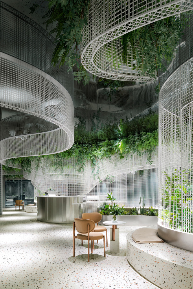
More businesses today are striving to become eco-friendly, and Vista Coffee Shop in Guangzhou, China, is packed with greenery. The design of this café is inspired by everyday memories, and it offers a sense of imagination and lightness to your coffee shop experience. It would be the ideal place to bring your laptop to work, as surrounding yourself in nature offers so many benefits to individuals. Plants are being added more and more to offices and buildings nowadays, as business owners notice the huge difference they can make to people’s wellbeing and mental health.
13. A Simple Coffee Shop Space in Thailand


When designing a new coffee shop, you don’t have to spend a fortune or build an extravagant building in order to draw customers in. This coffee shop in Thailand offers a welcoming and cozy environment and would be the perfect spot to meet your friends or enjoy an afternoon coffee after working all day long. It draws upon natural elements, such as wood, in its design, which makes it look attractive to passers-by. We also appreciate the amount of natural light that the space receives, which makes sitting indoors even on a sunny day more enjoyable.
14. A Modern Colombian Coffee Shop

As one of the world’s top producers of coffee, you can be sure that you’ll find some incredible coffee shops in Colombia. The Mustapan Coffee Shop in Chipaque is a modern and welcoming space that attracts a young and trendy Colombian crowd. One of our favorite features of this coffee shop is the open roof design, which brings in more natural light into the space. This would mean it’s ideal for working in here during a summer’s day, as you won’t feel like you are missing out on the sunlight while still getting everything you need to do completed.
15. A Coffee Stand Decorated with Plants

Even with just a small space, you can make the most of your coffee stand. This small coffee stand located in Prague in the Czech Republic is decorated with plants. It’s another great example of adding greenery to your space, even if it is just a smaller coffee stand. The other great thing about this coffee shop is that it serves coffee directly from its own roastery. It’s the perfect community spot that could easily be reproduced in any office or mall.
16. A Library and Coffee Shop

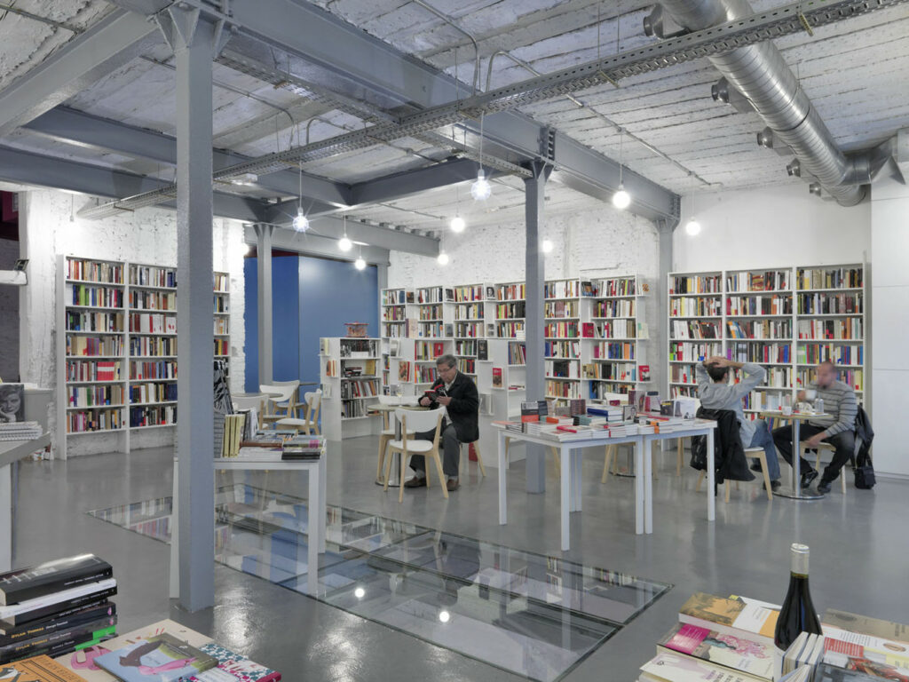
When you are studying or working in a library, there’s nothing better than a cup of coffee to push you through an intense working day. Located in Madrid, Spain, this space makes the most of the area they have and creates a cozy coffee shop that would be ideal for catching up with your friends and family. We also love the glass floor that showcases the area underneath, and it helps to add a little more light to any room. This basement floor will be a gallery space in the future, which will be a lovely addition to this coffee shop and library.
17. A Wooden Coffee Shop in South Korea


Wood is one of the most popular materials to use within a coffee shop’s architecture. This coffee shop is located in South Korea, where they have a thriving coffee industry. These small coffee shops are continuing to lead the development of this industry in the country, and many of these stores have different values that they showcase throughout their stores. This coffee shop is located within an old wooden house that has been redesigned as a studio design space. It blends modern and traditional design elements and is a welcoming place that anyone in the local area will enjoy visiting.
18. Kilogram Coffee Shop in Indonesia


Kilogram Coffee Shop in Indonesia is designed to meet the needs of locals while also offering a flexible working space. As well as being used for these commercial purposes, it aims to create an environment that blends in with the natural environment around it. It helps to offer a new location that you could enjoy working in each day while also enjoying sampling the local coffee the store sells. The broad veranda offers some much-needed shade on a hot day and is a design feature that can be incorporated into any coffee shop in an area with a hot climate.
19. A Modern Shanghai Coffee Shop

Here is another great example of a Shanghai coffee shop, which keeps up with the modern aesthetic of the city. This coffee shop is located on the first floor of an older building in the city, however, it still looks much more modern than the previous building did. The building was designed with the brand founder, coffee roasters, and constructors, and it aims to create a multipurpose space that can be used by a wide cross-section of the population. As well as serving great coffee, it offers retail areas, event spaces, and coffee roasting facilities.
20. A Coffee Shop in Vietnam with Plenty of Natural Light


Natural light is something that more of us are looking for when visiting coffee shops today. This coffee shop in Vietnam is a great example of maximizing windows to bring in more natural light. Instead of feeling like you’ve been stuck indoors all day long when working, you’ll find that you feel like you’ve spent time outdoors and don’t feel so drained. We also love the unique triangular design of this coffee shop from the outside, which is like nothing you’ve ever seen before.
All of these coffee shops look absolutely fantastic, and we hope that you’ll be able to visit one or a few of them in the future. A coffee shop design should offer a welcoming and modern environment where you feel comfortable drinking and relaxing. As more of us than ever before are still working from home, you’ll find these all to be great spots to enjoy working from for a day away from your home office.