Sherwin Williams Sea Salt Color That Homeowners Are in Love With

Sherwin Williams Sea Salt paint is one of the most popular paint colors out there. The muted color is very versatile and works for everything from modern farmhouse decor to glamorous, serene luxury bathrooms.
What Color is SW Sea salt?

Sherwin-Williams Sea Salt (SW 6204) is a super popular blue-green paint color that homeowners love for its versatility. Technically it is a green paint. Moreover, although it works with lots of other colors, it is not necessarily a neutral paint color.
SW Sea Salt has a Light Reflectance Value (LRV) of 63, which is a little more reflective than some other popular blue-green paint colors. The LRV scale runs from 0 to 100 and the higher the number the more light a paint will reflect.
In general, it has that relaxing, coastal feel that many people are going for in their interiors.
SW Sea Salt vs BM Sea Salt Paint

Just because the names are the same does not mean the colors are. Sherwin Williams sea salt is green but Benjamin Moore Sea Salt is not. In fact, they don’t look alike at all. This is because BM Sea Salt is a gray color that exhibits
Don’t confuse Sherwin-Williams Sea Salt with Benjamin Moore Sea Salt. They are not even close! BM Sea Salt is a gray or greige color that is warm with some purple undertones.
A Color Chameleon
While Sea Salt paint is green, often it can look rather blue, depending on the lighting. This tends to happen when the room faces the West. It’s also the case in North-facing rooms where the sunlight is more diffuse. Even in those cases, it remains a blue green paint color.
Rooms that face the south that are painted in Sea Salt will see more of the green color come out. The warm light brings it out, as will warm artificial lighting.
Cool Undertones

SW Sea Salt has cool undertones and most of the time, it’s a perfect blend of gray and green.
Plentiful natural light, which is common in today’s open-plan layouts, makes Sea Salt more changeable. You’ll notice that at different times of the day the paint color will look different depending on the lighting.
Sometimes the blue undertone will be more prominent while other times it will look green. In either case, the gray undertones have a moderating influence.
Despite the gray undertones, it will never actually look gray.
Coordinating Colors

If you’re looking for coordinating colors, you can’t go wrong with the ones on the same color strip as Sea Salt. One of those colors is SW Comfort Gray, which is a darker shade, but not too dark.
While you can find plenty of other hues to match up with Sherwin Williams Sea Salt, the company’s website recommends three. Spare White (SW 6203) is a very pale beige or greige.
If you want something that’s much darker, consider Summit Gray (SW 7669), which has an LRV of 30. For a pale gray, take a look at Fleur de Sel (SW 7666).
Other neutrals to paint with this color are Accessible Beige, Malabar, or Kilim Beige.
Gray Partners
Often, homeowners like this Sherwin Williams color because it pairs well with many shades of gray. In fact, the blue undertones make this an ideal pairing with a true gray.
Sherwin Williams lists a number of gray colors, including Comfort Gray. But, if you love Agreeable Gray, that’s a good match too. Just remember that it has more of a greige nature than being a true gray.
Bold Contrasts
To create bold contrast, try pairing the Sea Salt paint color with a really dark hue like black or navy blue. A deep teal could work with it too.
What Rooms are Best for SW Sea Salt?
You can use Sea Salt in any room. However, be sure to test a sample in your specific lighting situation. You might be aiming for a splash of watery green and en up with something that looks darker.
If you have a dark room, you might want to consider Sea Salt as an accent instead. Moreover, if your room is bathed with a great deal of sunlight, SW Sea Salt might actually look blue.
Paint a Sample of Sea Salt in Your Room
It’s quite surprising that many people still don’t sample paint colors at home. Instead, they look at the paint strip in the store, pick a shade, go home and break out the roller and brushes.
Sea Salt is such a changeable color that it’s super important to paint a sample in the specific room you’re redoing.
Instead, buy a sample container and paint a square on the wall. Or, order a peel and stick sample. Either way, make sure you view the color in the room at different times of the day, including at night. Indoor lighting can make it look very different.
Rooms Painted Sea Salt
You might already have ideas about where you could use Sea Salt walls. If not, there’s lots of inspiration out there for ways to incorporate this paint color. We love Sea Salt and think you will too.
Clean, Crisp Coastal Style

We absolutely love the relaxed but sophisticated coastal style of this Charleston home. Bright white trim and horizontal wainscoting emphasize the length of the space. The chic lighting and and wood door stand out in the clean design.
This entry hall also shows how you can paint an entire space in Sea Salt because it looks great.
Spa-like Serenity

With the spa bathroom trend still going strong, the Sea Salt color is ever more popular. That’s because it strikes just the right calming vibe in any style.
This lovely contemporary master bath has on-trend gray cabinets and chic marble tiling with gray veins. The Sea salt paint is a perfect pairing and helps the space maintain a touch of relaxed glamour.
The Blue Side of Sea Salt
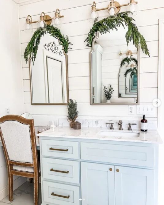
Yes, Sherwin Willians Sea Salt is a blue green color, but mot of the time the green tones tend to dominate. Not in this farmhouse bathroom, however.
Flooded with daylight, the space provides a glimpse of the bluer side of this paint. It also looks like an accent color in a bathroom full of white and cream.
Coordinated Kitchen
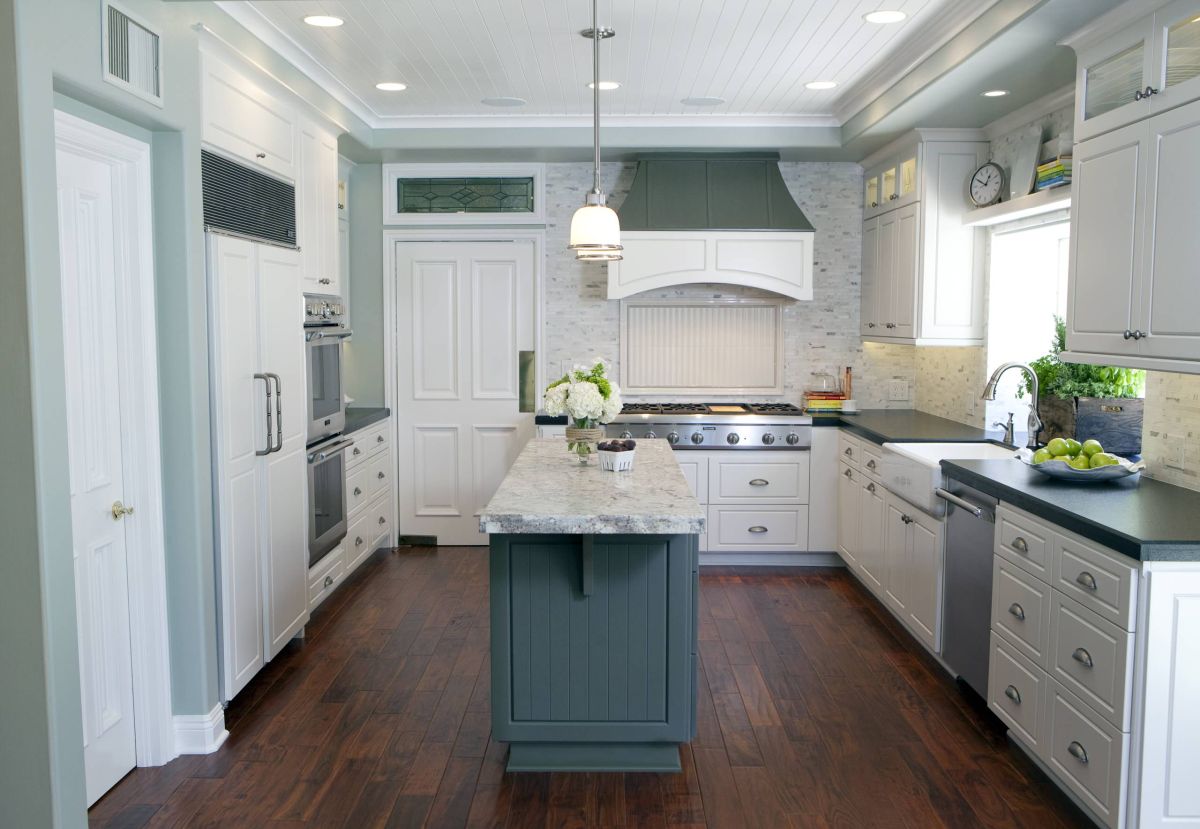
If you chose Sea Salt for the kitchen, you had options. It makes a great color for all the walls or for kitchen cabinets.
Here, the Sea Salt walls bring out the gray bits in the backsplash. You might notice that it looks a little darker. This can happen when natural lighting is limited and the room relies on artificial light.
For an accent, the designer used darker shades in the same style of blue green as Sea Salt. Although this kitchen uses a custom paint blend for the island, it’s not hard to find similar paint colors.
Sea Salt Cabinets

This drool-worthy two-story kitchen has Sea Salt cabinets as its focal point. Since the place is bathed with sunlight, the color is lighter. It even brings out some of the gray in this versatile paint.
You can see how the Sherwin Williams paint is ideal for a farmhouse feel, thanks to the rustic wood. Of course, take away the wood and it has a more contemporary vibe. Either way, this Sea Salt kitchen is a definite winner.
Mostly Monochrome

This living room might be smack in the middle of a city, but it sure has a relaxed beach-inspired ambiance.
The walls are painted in Sherwin Williams Sea Salt and the overall color scheme sticks to this calming color. Besides the one standout furniture piece, everything else is a soft, muted green shade. In this lighting, you can see more of the color’s underlying gray tones.
Mixing pure white trim and softer white elements like the furniture works with blue greens like this.
Shifting Shades

Here’s another good look at the chameleon-like nature of Sherwin Williams Sea Salt.
This living space has all the wall painted in Sea Salt, but different undertones are visible. The closes wall gets lots of daylight but those in. the back don’t. You can see how much darker they are.
In fact, note the similar but darker tone on the ceiling. It helps bring out the deeper undertones of the Sherwin williams paint.
Beachy Bedroom

If there’s any room in the house that you want to feel relaxing, it’s the master bedroom. Paint the bedroom Sea Salt and you can breathe deep and relax.
This space also combines white cabinets and trim with bedding and rug colors that include beige tones. In fact, it’s the rug that helps tie everything together.
Here too, you can see the changeable nature of this chameleon color. It looks much more vibrant in this space because the specific lighting situation.
Light-Filled Bedroom

If you thought Sea Salt was always a definite blueish green, this bedroom shows its softer side.
Plentiful natural light, warm tones and a neutral color palette make it feel airy and bright. You can even see how the color changes across the room. Closer to the window, it’s rather pale. However, at the far side of the bedroom, it looks darker.
Sophisticated Style

Although this Sherwin Williams paint is associated with a beachy, casual vibe, it can feel more refined too.
With specific details and a number of gray elements, this contemporary bedroom feel a little more “buttoned up.” The accent wall behind the bed has detailed molding, but it too is done in Sea Salt. this differentiates it from the standard trim in the room.
Keeping a soft palette but using a bolder gray headboard also creates the contrast that makes the accent wall pop.
Farmhouse Laundry Room
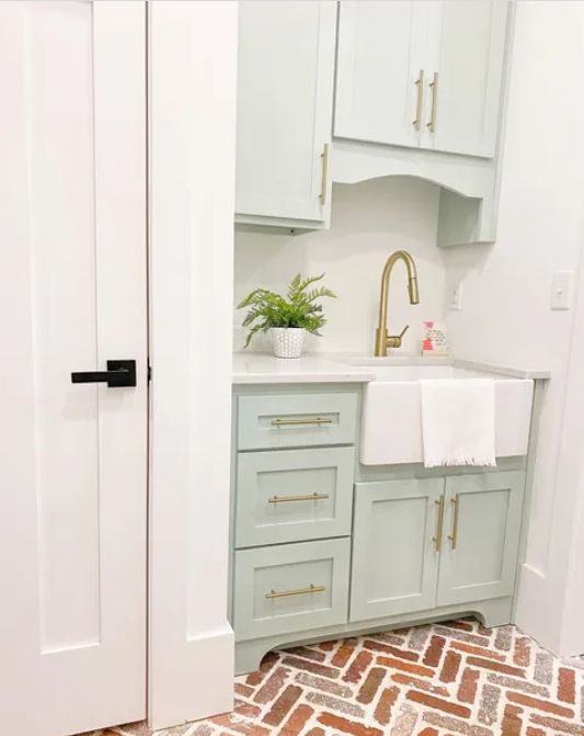
If you have a farmhouse style house, Sea Salt is probably already on your radar. However, you might not have considered painting cabinetry in this paint colour.
A small but chic laundry room sink area shows how well this Sherwin Williams paint works. Gold hardware adds a nice warm accent to the cool color cabinets.
Cottage Style Dining Room

Paint colors that work for farmhouse style are also fabulous for cottage style interiors.
This dining space is super inviting and part of that reason is the Sherwin Williams Seas Salt on the walls.
Everything in this eclectic space works. There’s very little natural light around the sides of the room. This brings out the darker color in the paint and pulls together all the other elements. Sea Salt is ideal for spaces whose decor has a natural vibe.
Rustic Dining Room

A rustic dining room has a similar natural vibe as the cottage style example, but the paint looks quite different.
Flooded with natural light, the Sherwoin Williams Sea Salt undertones of gray come to the fore. The natural color scheme and rougher wooden elements also come into play. Most of all, the space retains a fresh and contemporary feel.
Exterior Style

Sherwin Williams Sea Salt is great for all kinds of indoor space, but also for the exterior of your house.
Check out this new home that is painted with Sea Salt. The dimensional facade is perfect for this color. It has three different surfaces: vertical siding, horizontal siding and wooden shake style. On each of them, the paint slooks a little different. That’s a testament to its chameleon qualities, even outdoors.
Soothing Entry

If you don’t want to paint your whole house in Sherwin Williams Sea Salt, try just the front door.
Refresh your door and front porch by giving it a calming effect with a court or two of Sea Salt. It’s not the typical bold color recommended for a door, However, you can see how it really pops against a darker house with white trim.
You’ll get the same effect with a Sea Salt door and natural wood siding. Or, match it up with a white house for a fabulous farmhouse or beach feel.
Frequently Asked Questions (FAQ)FAQ
What color is sea salt Sherwin Williams?
Sea Salt is green with undertones of gray as well as some blue. It’s a blue green that’s among the cool colors, rather than warm ones. However, it is changeable in different types of light, sometimes looking lighter or darler, or even more blue than green.
Is Sherwin Williams Sea Salt popular?
Today’s homeowners seem to love coastal colors like Seal Salt. After the ever-popular gray and greige colors, Sea Salt and similar colors are most sought-after.
Does Sherwin Williams Sea Salt look blue?
Yes and no. This Sherwin Williams color is bluish green and in most cases, predominantly green. However, in certain lighting the blue undertones come to the surface. This shade of paint is a color chameleon. Hence, it’s very important to stick paint samples on the wall in the specific places you want to paint. Check the coloring throughout the day to make sure that you like it.
What colors look good with Sherwin Williams sea salt?
What Colors Coordinate with Sherwin Williams Sea Salt?
In general, you can make Sea Salt work with a wide range of white, gray, beige or greige colors to go with Sea Salt. Among the most popular pairings from Sherwin Williams are Spare White, Fleur de Sel, Malabar, Accessible Beige, Kilim Beige, Summit Gray and Stardew.
Does repose gray go with Sea Salt?
Sherwin Williams Repose Gray has blue undertones so it is a good complement to Sea Salt.
What white goes with Sherwin Williams sea salt?
Sea Salt is a paint color that wors very well with crips, pure whites that have a high LRV. One example is SW High Reflective White. Some of the softer off-whites that pair well with Sea Salt are SW Greek Villa and SW Alabaster.
What is the Benjamin Moore equivalent to Sherwin Williams sea salt?
The Benjamion Moore color named Sea Salt is nothing like the Sherwin Williams color. If you want a similar color from Benjamin Moore, consider Gray Cashmere (2138-60), Cool Breeze (CSP-665) or Night Mist (1569).