Decorating with Luscious Pastels Adds Zippy Flair to a Plain Space

There’s always much ado about adding bright pops of color to a room, but they’re not the only way to brighten a space. Decorating with pastels can add dimension and color while maintaining a calm vibe. Pastels are a wonderful way to add a new hue to a neutral space without going overboard and can also be used to tone down a room that’s already got enough bright colors happening. Besides, using pastels is not just about painting the walls. Sure, that’s an easy way to create a base for a room but opting for furnishings in pale hues is also a versatile way to work a lighter palette.
Softly Colored Sofas

The shape and style of the sofa you choose — along with the other pieces you group with it — will influence the impact of the pastel color palette. This sofa from Polart is a light pink, but it makes a bold statement thanks to the silhouette and materials used. By grouping it with more pieces in the same color, it becomes very dominant in the space, even when mixed with brighter tones, like a kelly green.

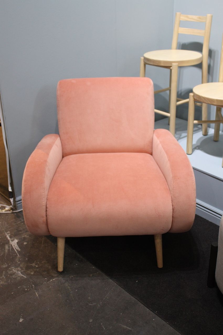
Pretty in peach, this elegant sofa shows the softer side of the pastel palette but doesn’t sacrifice impact. The curving shape and high sides speak volumes in glamour, which is highlighted by the choice of velvet upholstery. Placed in an otherwise neutral space, the sofa is a standout, which is demonstrated by the beige throw pillows, which push the focus back onto the color of the sofa.

Equally elegant but with a more modern edge, this pastel citrus colored sofa derives its boldness from the shape. The color of the upholstery is a perfect pairing for the dark metal frame, which might get lost with a more vibrant tone on the cushions. In fact, this is a great example of how a pastel hue can help highlight the interesting frame or legs on a piece of furniture.

The sofa shows how a pastel can be used in a multi-tonal piece to highlight the color family in the room. While the wall covering behind the sofa is neutral, it does have a strong pattern, which could compete against a sofa with a bold color. This piece combines an overall pastel color combination that is accented with cushions covered in darker shades of the same color range. The addition of just a couple of patterned pillows — still in the same color family — is just enough to make the sofa pop. As a bonus, the pattern on the wall almost looks like an abstract version of the one on the pillows.
Subdued Lighting Fixtures

Swapping out a metallic light fixture for one that features a pastel color is an easy way to incorporate lighter colors into a room. This decorating idea will work in any space. If a room is bright and light, an oversized, modern fixture in a pale hue emphasizes the brightness and adds a hint of color. If it happens to be a predominantly white decor palette, a cool citrus light fixture like this one will become a dominant feature. It’s important to remember that the size of the fixture can help increase the impact of the color or play it down, depending on the goal in the room.

A pastel light fixture can also help brighten a dark space. Here, traditional Japanese paper lanterns in graduated sizes are rendered in a pale salmon color. The works nicely in the dark space and is a lighter touch combined with the serious vintage furnishings. Adding pastel hues in a room that has little natural light or seems a bit closed in is another way to lighten the mood of the space.
Luscious chairs

Adding a pastel-colored chair to a room is almost like popping one of those pale-colored after dinner mints in your mouth: It makes you smile and say “ahhhh.” This gray and mint green chair combines a sturdy angular frame with cushy velvet upholstery in a deliciously cool hue. With gray being a commonly used neutral in many homes, pastels are a match made in heaven. The cool colors on this chair are accented with the stud detailing around the edges.
A cushier choice is a well-padded armchair. This peach velvet seat has a mid-century modern vibe with its wooden legs and a stylish silhouette thanks to the rounded arms. A chair like this could be combined with neutrals or added to a living room that is already chock full of prints and patterns. It’s also versatile enough to transform a bedroom or office as well as a living room. While it might seem like a contradiction, this is a bold pastel choice.

It’s also possible to amp up the impact of pastel furnishings through repetition and bold styling. These two chairs by Boffi are upholstered in a pastel salmon color but the abundance of gold and the throne-like shape make them more dramatic. In addition, the giant size of the lamp makes it whimsical and the color of the lampshade more pronounced.

Bold, dark florals are trendy both in fashion and furniture, and by pairing them with a pastel in the same piece, it possible to have a totally different look. The black frame and powerful rose print on the back and arms of the chair are given more impact with the use of pastel pink for the seat. It’s a nice strategy for lightening the palette without diminishing the drama.

This pale pistachio tufted bench is almost like a dessert confection. Adding this to a bedroom will inject a big dose of glamour and style. The light green would be a delicate accent in a neutral color palette and could serve as an accent in a room that is already done in another pastel hue, like this pink one. The bountiful use of pastels in a bedroom make it more soft and feminine while a well-chosen piece or two can add a seductive edge.
Unexpected Wooden Finishes
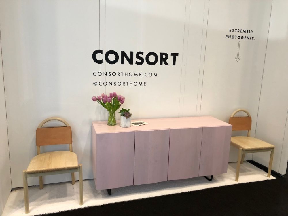
Furniture finishes have become more innovative and pastel colors are the go-to choice. Consort’s Bosse credenza comes in a range of lacquer colors and this blush shade is sophisticated and eye-catching. Paired with natural wood pieces, it is a focal point, but it would also be ideal to mix with patterned upholstery for a soft but trendy touch. A quality piece of wood furniture in a pastel tone will brighten the rooms of generations to come — perfect for becoming a family heirloom.
The range of stylish furnishings available show that decorating with pastels doesn’t have to be limited to paint and pillows. Designers have created plenty of options for those who prefers their colors to be understated and serene. Try adding a piece to a bedroom or living room and see how it brightens the feel.