Combine Bold Colors Like A Pro

Bold colors are on-trend for Fall 2013. While this is exciting news for those of us who love color, it can be a little intimidating to know just how to incorporate such boldness into our homes. After all, it’s the nature of bold colors to stand out – which is a good thing only when the use of the colors make sense. Here are some tips and tricks on how to combine bold colors like a pro:
Decide on a color palette.
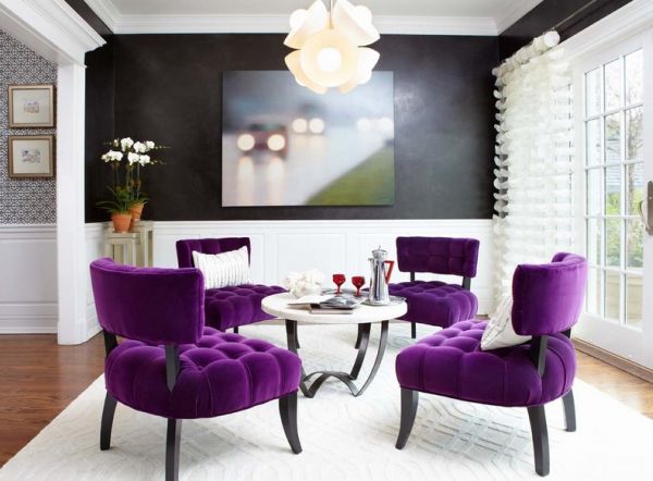
One or two bold colors are usually enough for a single space. Black is definitely bold and can be incorporated for a sophisticated touch, but keep it within tasteful bounds so as to not overwhelm or darken the space. Also, black-and-white is a bold, albeit classic, pairing and doesn’t usually require more than one other bold color.

It’s helpful to keep in mind some basics about colors. First, complementary colors, or colors across from each other on a color wheel (red and green, yellow and purple, blue and orange) tend to look well when paired. So do analagous colors, which are colors that are right by each other on the color wheel. (The fresh bold kitchen, in lime and turquoise, is an example of analagous colors.)
Determine a focal point.

One you’ve decided what you want to emphasize in your space, you can use bold colors to inherently highlight that focus. Here, a rich cobalt blue wall is paired with bold fuchsia (and a bit of red) to create a stunning vignette.

Keeping your focal point in mind as you thoughtfully decorate your space, you can choose where to go bold or not. Here, a French armchair is unexpectedly and delightfully covered in red leather. This bold color actually helps to draw out other accents around the room, such as the red in the large painting directly behind it.
Keep bold colors within the scope of the space’s overall style.

White walls and light floors provide a crisp, clean backdrop for some pops of color. The bold colors used in this room are spread throughout the space, both horizontally and vertically. The colors maintain the clean lines and fresh feel of the overall living room.

Obviously, if you love color, don’t be afraid to just go for it! This contemporary space is energized with bold, zesty color (and minimal pattern, so as to not compete with the colors). Note how one piece – here, the large modern artwork – ties everything else together and helps it to all make sense.

This dining room’s charming cottage style is emphasized and modernized by the bold coral chairs. The style of the chairs themselves is traditional like the space itself, which gives them the liberty of being a bold color and still fitting in.
Balance bold colors with neutrals.

Neutral can, but does not have to, mean natural. These kelly green dining chairs are an excellent example of how one bold color choice can balance a neutral palette – one pops, the other soothes. Yin and yang in décor, right here.

A neutral palette of light and dark browns oozes sophistication more than “back-woodsy” due, in large part, to the bold colors here. Mustard and magenta are similar enough to the other tones but much richer and more vibrant, which makes them a wonderful style and color balance to this space.

When a space is comprised of mostly neutral elements (walls, drapes, rug, sofa), the use of smaller doses of the neutrals’ bolder counterparts are engaging and enlivening. Varying shades of orange, aqua, and fuchsia here actually bring out and balance the more muted tones.