The Timeless Charm and Nuances of White in Design


White is an achromatic color and a symbol of purity and simplicity. In its purest forms, white reflects all waves of visible light.
Designers use white to brighten spaces. Its versatility allows it to adapt to various design styles, from minimalistic and contemporary to rustic and traditional.
White’s Symbolic Associations and Influence on Design

White is a blend of additive colors: Red, green, and blue. It’s a symbol of cleanliness, simplicity, and purity.
The Purity of White
As the color of purity, white lacks hue and colorfulness. It symbolizes new beginnings, such as a fresh start, a new chapter, or a clean slate in many cultures. In ancient Greece, white was the goddess Athena’s color, representing purity, wisdom, and virginity.
In Christianity, white is often used in baptisms, weddings, and funerals. White shows any blemishes and dirt. It’s a standard color on doctors’ coats and gloves.
The Spectrum of White
According to color theory, white light combines all the colors in the visible spectrum. Since white lacks hue and saturation, it’s considered neutral. Interior designers use white color to make a tint of any colored hue.
White appears on the grayscale as the highest value, 255. The opposite end represents black, whose value is 0. All values between are shades of gray. White, like black and gray, is an achromatic color.
White’s Emotional and Psychological Effects
The color white evokes feelings of calmness and serenity. Many hospitals and interior designs adopt it as their primary color. White adds sophistication, luxury, and elegance when paired with other high-end materials and textures.
But white can feel cold, distant, and impersonal, and using too much causes glare. Combining it with other colors is ideal for the best results.
White’s Subtle Variations
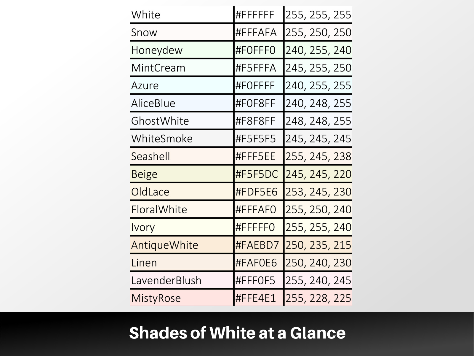
White has several shades, each with subtle variations in color and tone. White shades are often referred to as “off-white.” The colors vary slightly from pure white.
Snow White
Snow white is a bright, crisp white with a slight blue or cool undertone. It’s often used in winter-themed designs or medical settings. Snow white pairs well with other “cool” colors, like pastel blue, indigo, violet, and black.
Ivory White
Ivory is a warm shade with a slight yellow tint. Compared to cream, ivory appears more white. The name is derived from the hard, white material found in the tusks of elephants and walruses. In many cultures, ivory white symbolizes wealth and prosperity.
Add an ivory area rug, curtains, or decor to create a warm and calm atmosphere.
Pearl White
Pearl white has a soft, reflective quality that gives it a slight shimmer, similar to the luster of a natural pearl. Depending on the lighting conditions, it can appear pink, blue, or green. A pearl-white color palette adds a touch of luxury to a neutral space.
Pearl-white color themes are common in kitchens and bathroom walls and ceilings. You can also incorporate pearl whites into textiles and accessories such as lampshades and picture frames.
Antique White
Antique white is a pale, off-white color with gray undertones. It creates a sense of warmth, nostalgia, and timeless elegance. It’s a popular choice for interior paint, textiles, and furniture. Consider antique white in traditional, vintage, or shabby chic design styles.
Eggshell White
Eggshell white falls between pure white and beige or cream. The off-white color resembles the outer shell of a chicken egg. Eggshell white is often used in interior design and painting for its versatility and calming effect.
It works as a neutral backdrop paired with other colors and design elements. “Eggshell” also refers to a paint finish with a low sheen or luster in different colors.
Redefining Design Styles With White

A white color palette is suitable for various popular interior design styles. Interior designers use white as the primary or accent color to contrast or complement the primary color.
White in Coastal Design
Coastal designs feature white walls, ceilings, and other nature-inspired hues like blue and beige. White is also used on kitchen cabinets, kitchen islands, and bedding since it’s bright and makes a space feel larger.
White’s clean and fresh appearance creates a casual, laid-back atmosphere characteristic of coastal living.
White in French Country Design
French country designs adapt muted color palettes, antique furniture, wood tones, and elegant light fixtures. Ivory and cream are standard in most French country-style houses.
Off-whites are often used as a base color or in combination with other soft, muted colors. Designers pair off-white with pale pink, blues, greens, yellows, and grays.
White in Minimalist Design
A minimalist design is simple and focuses on functionality and order. White is a dominant color because of its simplicity and ability to create a sense of calm and openness.
White and black, gray, or beige maintain the minimalist color palette. Combining the colors adds an element of comfort and softness to the space.
White in Shabby Chic Design
White dominates most shabby chic interior designs. The shabby chic style features floral patterns, distressed surfaces, and antique decor pieces. The design uses white on walls, furniture, and flooring.
The Transformative Role of White in Various Design Elements
White has several functions in interior design, like creating balance, contrast, and simplicity.
- White as a Unifying Element: White creates harmony and cohesion in a design as a neutral color. White blends with other colors and helps unify different elements within a design.
- White in Textures and Patterns: White patterns are ideal for textiles, wallpaper, backsplashes, furniture, and lighting. Choosing fabrics with different weaves, patterns, or surface finishes can add visual interest.
- White in Architectural Elements: White complements modern and contemporary architectural styles. It makes architectural elements stand out and contrasts with glass, stone, metal, or wood.
- White in Outdoor Spaces: The color reflects light, emphasizing architectural features like moldings, cornices, columns, and arches. It helps highlight the texture and materials used in these elements.
The Art of Pairing White With Diverse Colors

White is impartial and can be used effectively with other colors. You can pair white with any color, just match the undertones.
White and Pastels
Combining a pastel color palette with white gives the room a brighter and more open feel. Use white to create a clean and bright base, and then add pastel accents to introduce a sense of warmth and softness.
White and Earth Tones
Earth tones include colors inspired by nature, such as browns, tans, greens, and taupe. White provides contrast to earth tones, highlighting specific design elements or features.
White and Bold Colors
Adding bold colors to a white space adds visual interest and creates a focal point. White provides contrast, creating a cohesive space without overwhelming the design with bold colors. Use white furniture against a bold-colored wall or add white accents to a space with vibrant furnishings.
White and Neutrals
Neutral colors like beige, gray, and black work harmoniously with white. A black-and-white color scheme is bold and contemporary. The color scheme is suitable for bathrooms as it evokes a sense of cleanliness and simplicity.
Enhancing Spaces With White Accents and Features

Incorporating white accents and features enhances a space’s visual appeal and functionality.
White Artwork and Wall Decor
White artwork and wall decor blend easily into various interior design styles. Add black and white wall art to add dimension to a plain wall. Use textures and patterns for a dramatic effect.
White Fixtures and Hardware
White fixtures and hardware suit modern, minimalist, Scandinavian, and coastal design styles. Consider using a different color if your space features a lot of white, such as white walls, countertops, or cabinetry.
White Architectural Details
White details brighten and contrast rooms with natural materials like wood, stone, or marble. For example, you could use white molding against earth-toned walls.