How to Use Chartreuse in Combination with Other Colours

Chartreuse colour is the colour halfway between yellow and green, often described as a pale apple-green. It is said to have been named “chartreuse” because of its close resemblance to the colour of a French liqueur called “green chartreuse.” Chartreuse, in French, actually means charter house. Chartreuse colour is a wonderful colour to use in home décor, but because of its unique aesthetic, you should use it carefully and strategically. This article will discuss some ideas for combinations with chartreuse colour, as well as ways to implement it into different spaces within the home.
Chartreuse Colour + Orange and Purple (but mostly White)
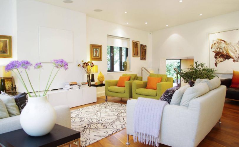
In a modern or minimal home, where walls and ceiling are white and forms are kept clean and straight, chartreuse colour combines well with other vibrant colours such as orange and purple to give a jolt of energy to the space. The neutrals of white and wood far outweigh chartreuse in square footage, but the visual balance with this proportion is just right.
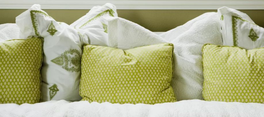
Chartreuse Colour + Moody Blue.

Because chartreuse colour is inherently unique, with its vibrant sort of off-color, it pairs beautifully with deep tones, including a dark moody blue. This rich velvety chartreuse bedding looks touchably luxurious and so elegant against a somber backdrop of midnight blue. A muted medium toned wood floor is the perfect unifying neutral.
Chartreuse Colour + Black & White Accents.

Classic black and white patterns in various scales and directions play beautifully off the electric feel of chartreuse. A chunky chevron and multi-directional stripes on throw pillows, along with a Greek key flat rug, all in black and white work to create cohesion and channel the energy of a chartreuse sofa without toning it down.
Chartreuse Colour + Salmon.

Neutralized by lots of neutrals (such as grey walls, white trim and bedding, and hardwood floors), chartreuse and salmon electrify a space in short order. Remember that with two vibrant colors such as this, a little goes a long way.
Chartreuse Colour + White.
White is the ultimate embracer and softener of colour. With its sharp visual zing, chartreuse is often most effective and appealing when rounded out, so to speak, with a touch of white and plenty of natural light.
Chartreuse Colour + Dark Wood.
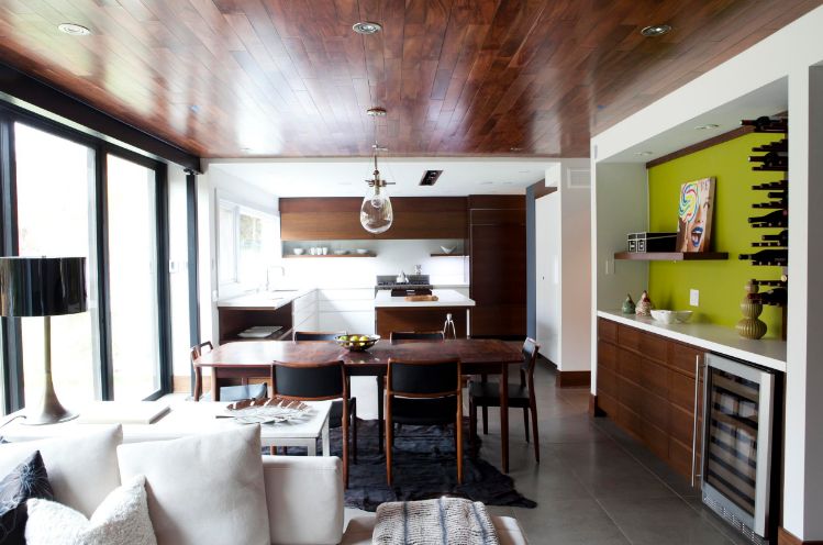
Dark wood tends to feel studious, somber, and wise. Chartreuse colour can work with dark woods in a space to keep those same atmospheric conditions…with a shot of youthful energy. Notice the contemporary ceramic floor tiles here as well. Everything is tidy and no-nonsense, which makes the chartreuse colour all the more appealing so we don’t take the open concept space here too seriously.
Chartreuse Colour + Medium Wood.

Medium-toned wood is neither serious (like dark wood) nor laissez faire or shy (like blonde wood). Its versatility of style makes it a perfect backdrop for a colour with some personality to spare. Medium wood tones actually match the tonation and saturation of chartreuse quite well, creating a comfortable and even space.
Chartreuse Colour + Blonde Wood.

Paired with blonde woods, chartreuse colour enlivens with a slightly retro-modern flavor. Be sure the space has plenty of natural light to give the duo a refreshingly spacious vibe.
Chartreuse Colour + Neutrals.

In a space of any size in which neutrals are the bread and butter of décor, chartreuse colour adds a nice visual zing. On occasion, all-neutral spaces can feel a little boring or stale, but that’s pretty much impossible if you throw in some chartreuse. Notice, again, how natural light brings out the best things about chartreuse colour.
Chartreuse Colour + Bedroom.

Many of us enjoy a peaceful retreat in the bedroom. If your bedroom is quite large, however, you might have space enough for different zones within the bedroom; in this case, chartreuse colour is great for delineating those spaces. A chartreuse sofa, for example, creates an engaging conversation area in the bedroom without taking away from the restful impact of the bed.
Chartreuse Color + Dining Room.

If your family is skilled enough to be at ease eating on super stylish chartreuse color loveseats at the dining table, then I can’t think of anything more ethereal. This citron-infused dining space looks simultaneously sophisticated and delicious! Ceiling-to-floor curtains, positioned symmetrically and to allow in a maximum amount of gorgeous natural light and natural greenery, look well in a slightly deeper shade of chartreuse than the furniture.
Chartreuse Colour + Contemporary Home Office.

When working with such a bold color, it’s important to keep other visual distractions in a space to a minimum. For example, this contemporary home office only utilizes one pop of chartreuse colour, to great effect, and downplays all other competing elements. Notice the acrylic desk leg and bare windows.
Have you identified useful strategies for incorporating chartreuse colour into your decorating? We hope you enjoy the energy and visual pop of this wonderful hue.