Color Psychology For Nursery Rooms. Learn How Color Affects Your Baby’s Behavior

When decorating a room, we base our color choices on our preferences and, while that’s ok most of the times, color selection is not exactly a simple process. Each color has different effects on the human body and mind and it’s important to take these into consideration, especially when decorating the nursery room. After all, you want what’s best for your baby. Learn how color influences the development and behavior of your child and find the best color for his or her room.
Warm Colors.

image by Chad Jackson
Warm colors usually stimulate the mind and energize the body. They make large spaces feel cozy and welcoming. However, they are not particularly relaxing so they’re not that great during the bedtime, especially for very energetic kids.
Orange.


Warm, comforting and cozy, orange is a stimulating color which inspires social interaction and communication. However, too much orange, especially if it’s a bold shade, can be over-stimulating.{image sources: 1 and 2}.
Yellow.
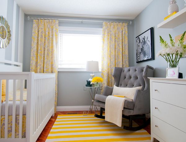

Yellow is a cheerful and energetic color which gives the room a sunny and bright look. It’s a color associated with happiness. Depending on the shade and intensity, subtle yellows stimulate concentration while brighter shades can stimulate the memory.{image sources: 1 and 2}.
Red.

Red is one of the colors which are not recommended for the nursery room, the reason being that the color is associated with aggression, inability to focus and headaches. Of course, this only happens if you use it in excess. If used correctly, red can actually have good effects such as energizing the body and increasing athletic ability.{image source projectnursery}.
Pink.


This is the universal color associated with girly things and princesses and that’s no coincidence. Pink is a calming and relaxing color and it evokes femininity and empathy. Initially, it has a calming effect but be warned that it can lead to agitation and anxiety so don’t decorate the whole room with pink.{image sources: 1 and 2}.
Cold Colors.
Compared to warm colors, cold tones usually have a calming effect on the body and mind. They make rooms feel spacious and relaxing. Dark shades, however, should be used in moderation to avoid creating a gloomy atmosphere.
Blue.

Blue is the opposite of red. It has a calming effect, it lowers blood pressure and decreases anxiety and aggression. Blue is also a good color choice if you wish to create a cool environment in a hot and humid location. Some particular shades however, such as gray-blues, can create a rather sad ambiance.{found on 4wallsandroof}.
Green.


Green is associated with nature and symbolizes health and well-being. It has a soothing effect on the body, increases concentration and some studies show that it can even increase reading ability. This makes it the best color for learning environments.{image sources: 1 and 2}.
Purple.

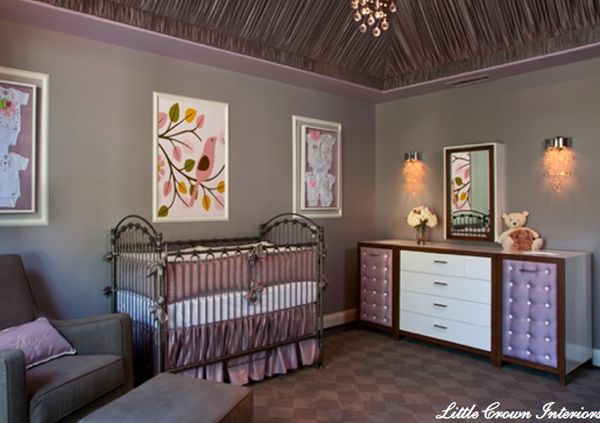
This color is associated with royalty and luxury but also with wisdom and spirituality. Pastel shades like lilac and lavender are calming and serene while darker shades pack a punch.{image sources: 1 and 2}.
White.


Angelic and pure, white is associated with innocence and promotes a calm and breezy atmosphere. White is also associated with secretiveness, modern, so it’s best to also add a splash of color to evoke openness.{image sources: 1 and 2}.
Gray.


Even though gray can be perceived as a gloomy, sad and cloudy color, it also evokes other emotions. For example, gray inspires you to contemplate and thus has a calming and relaxing effect. Still, it mostly promotes loneliness so use it in combination with warm tones and brighter colors.{image sources: 1 and 2}.
Black.
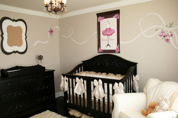

Nursery rooms rarely include black features. That’s because this is a color that should be used in moderation. It’s powerful and dark so use it if the room has big windows, lots of natural light and in combination with contrasting shades.{image sources: 1 and 2}.
Brown.

Earthy, warm and grounded, brown is a great color for a nursery. However, try to use either dark browns or light beige to avoid creating an unpleasant décor because of the associations with, well, ugly things.